BAFTA
BAFTA AWARDS
Client: BAFTA
Type: Product Production
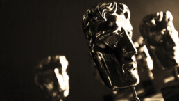
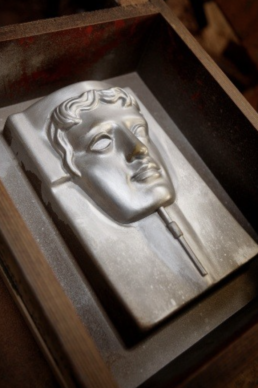
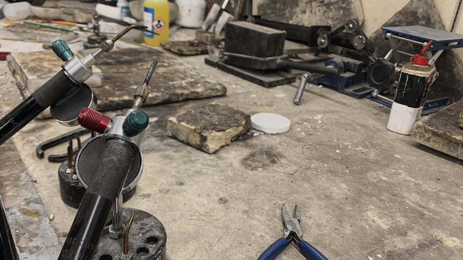
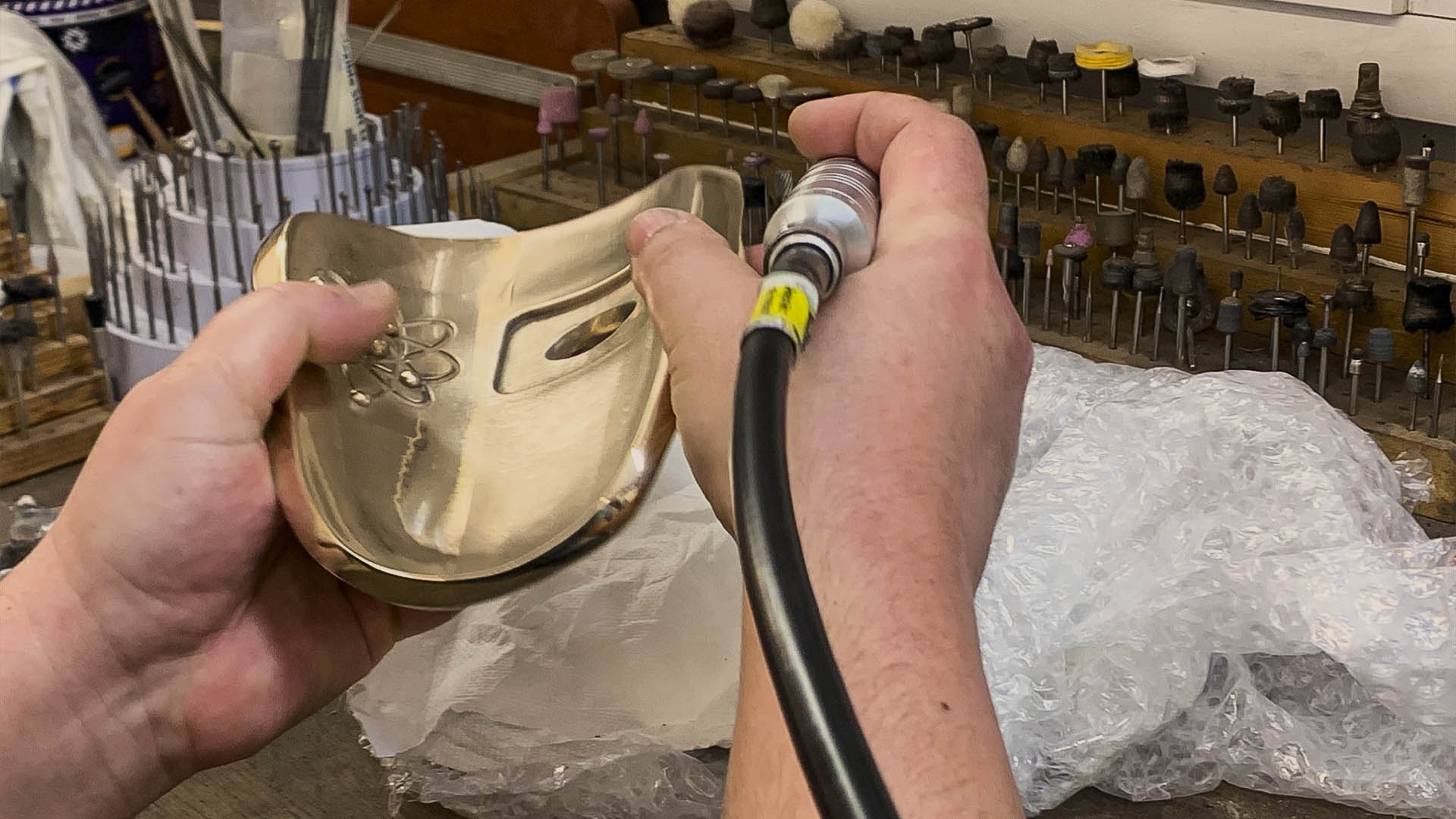
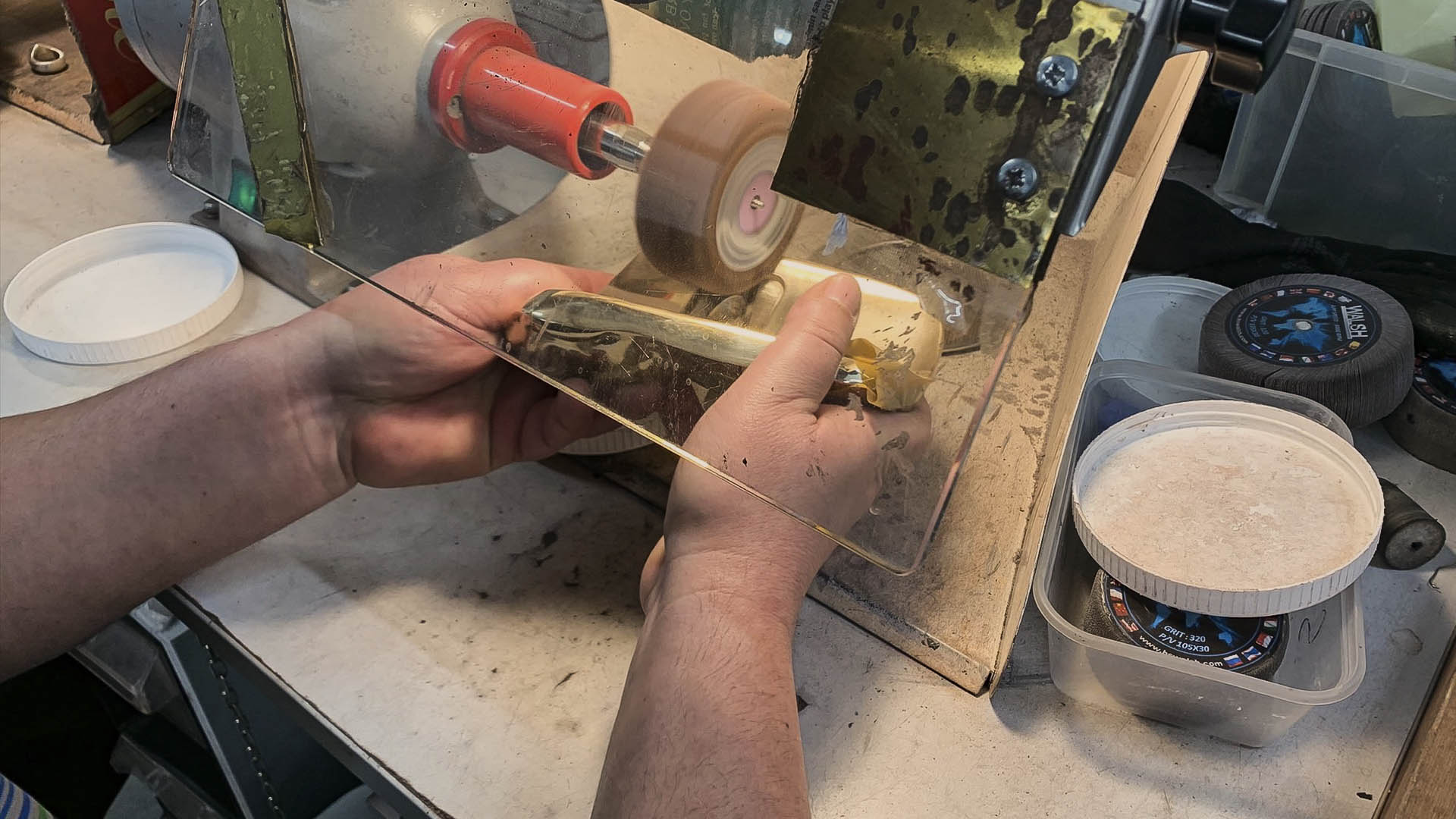
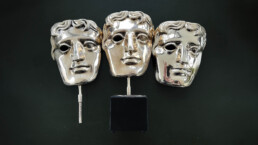
After 47 years of production BAFTA needed a permanent master mask.
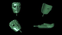
From a sample mask we created a 3D scan and then manipulated the 3D file in order to create a 3D master.
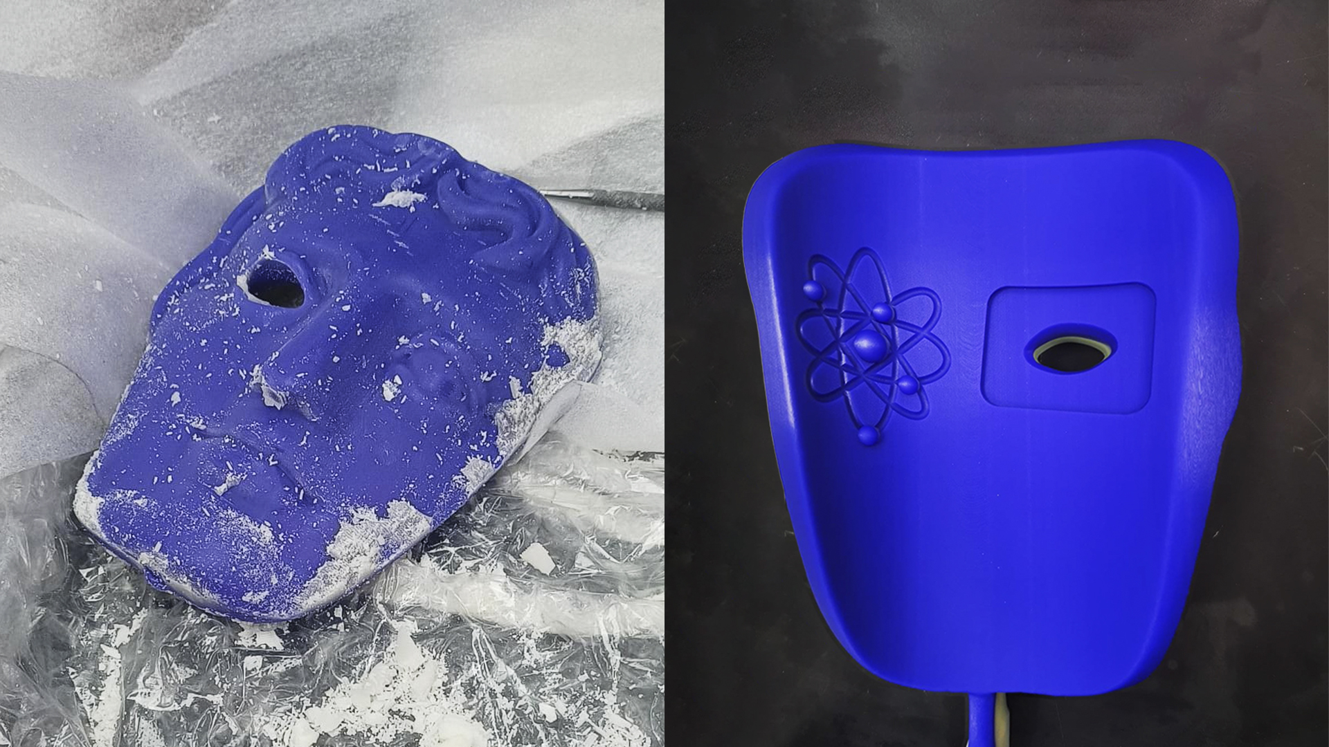
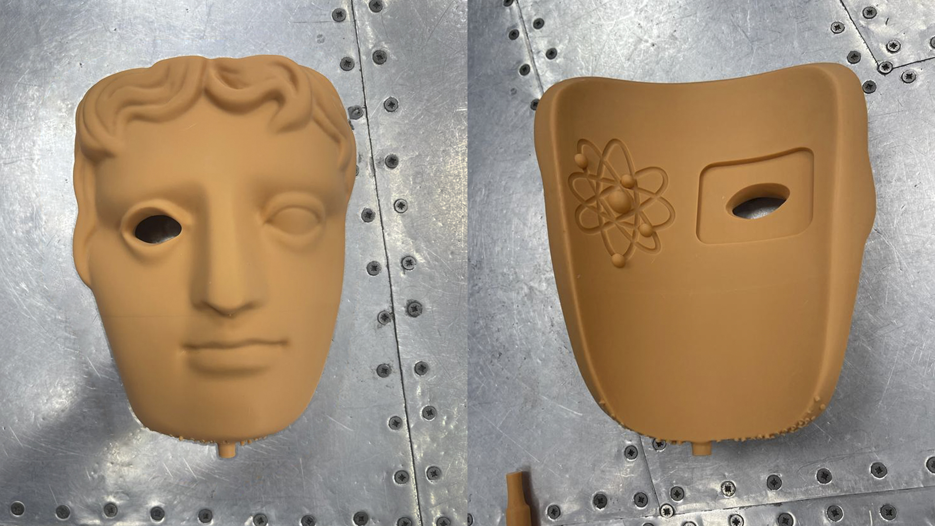
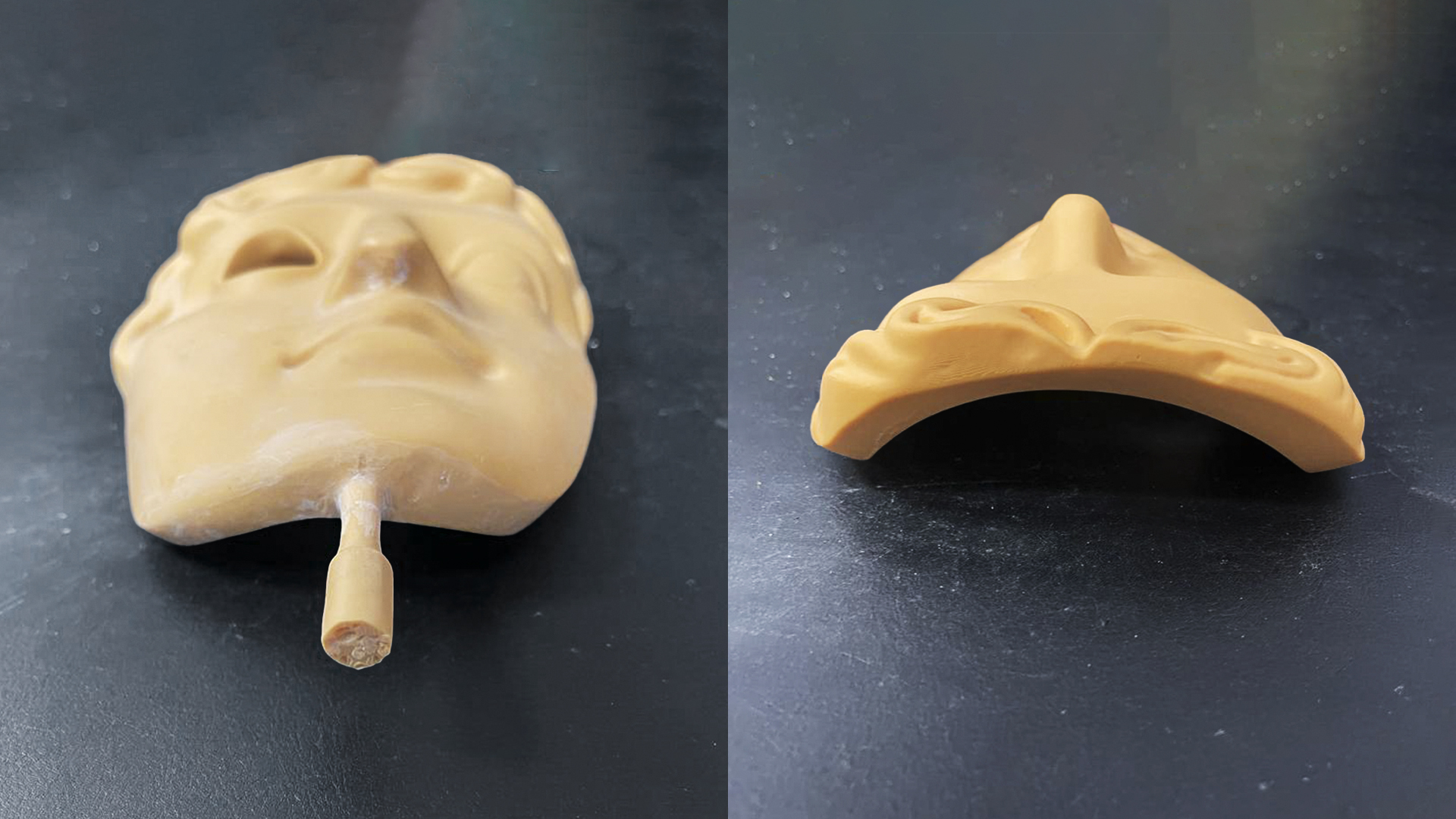
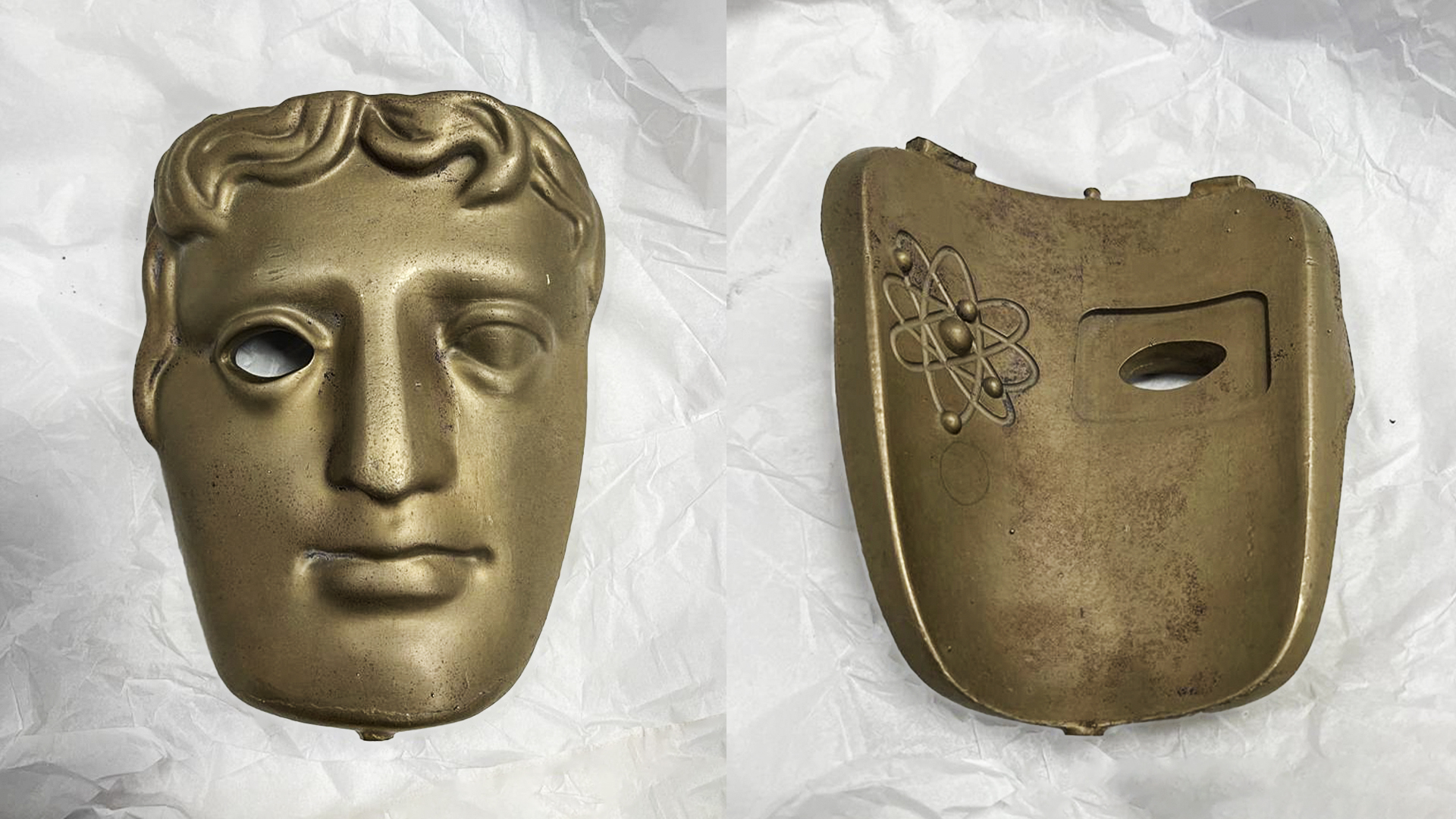
From the master 3D file, we used fine art crafting to create a wax maquette. We then cast the mask in moulds and meticulously created a sample, which was then buffed and polished to give it the shine and prestige look of BAFTA.
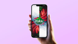
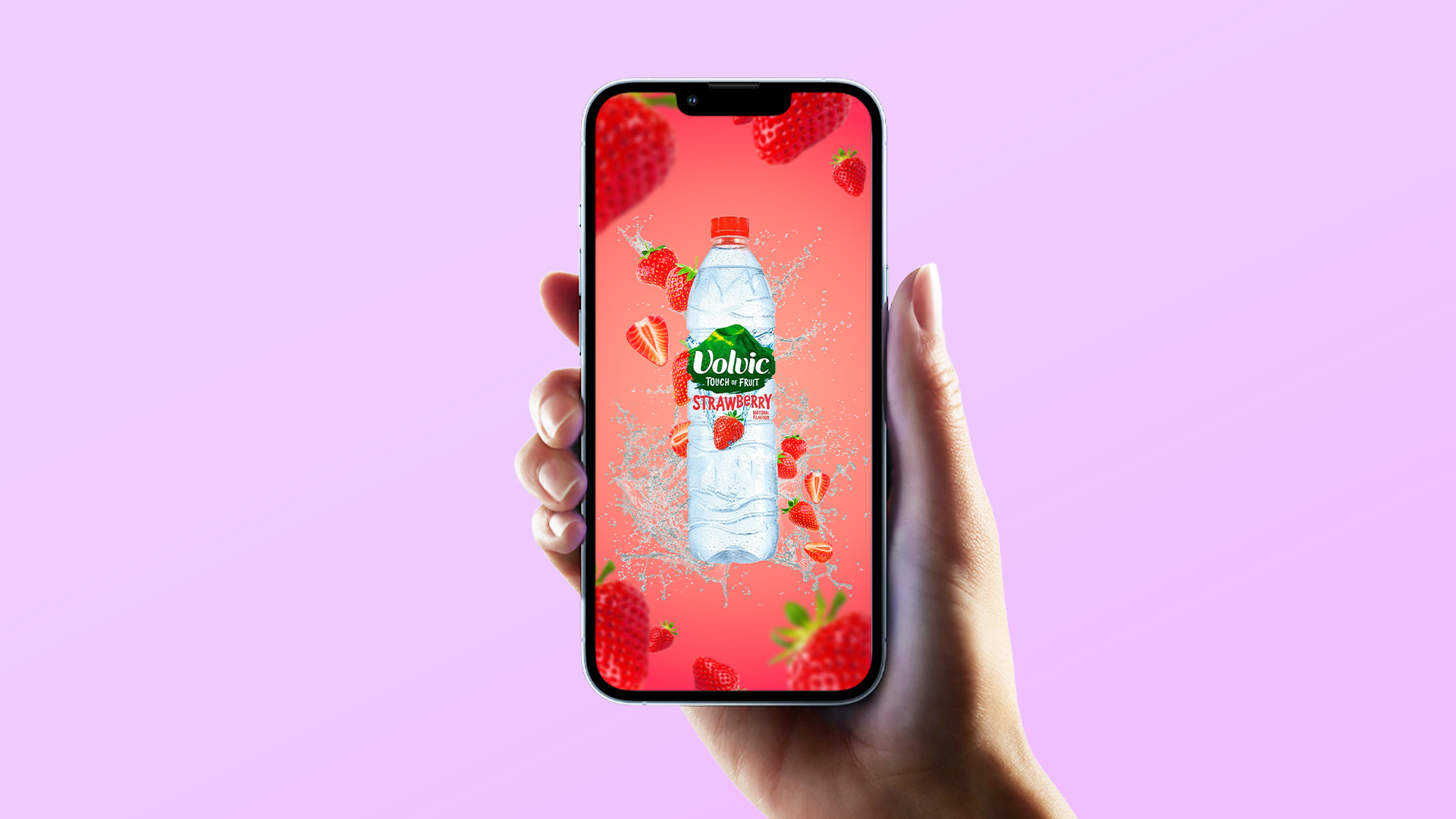
Volvic content branding
Volvic Content Branding
Client: Volvic
Type: Content Branding
We are thrilled to present our latest content branding project focused on Volvic, a renowned brand in the beverage industry. Our aim is to revolutionise Volvic’s content branding and create an unforgettable experience for their target audience.
Through meticulous research and strategic planning, we have developed a comprehensive approach that captures the essence of Volvic’s brand identity while captivating consumers.
By crafting compelling narratives, visually stunning imagery, and impactful videos, we will transport consumers into a world where Volvic becomes more than just a product—it becomes a lifestyle choice.

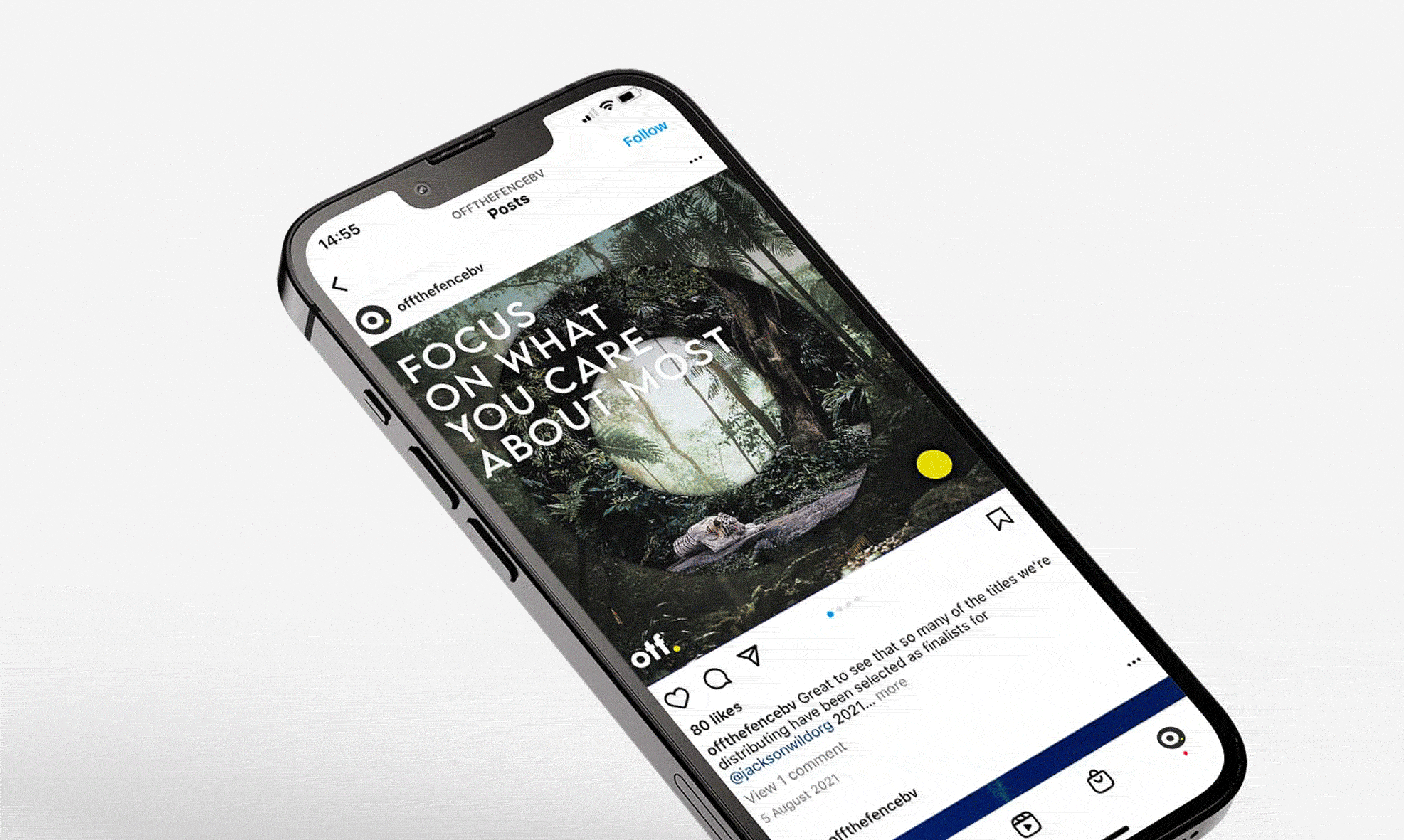
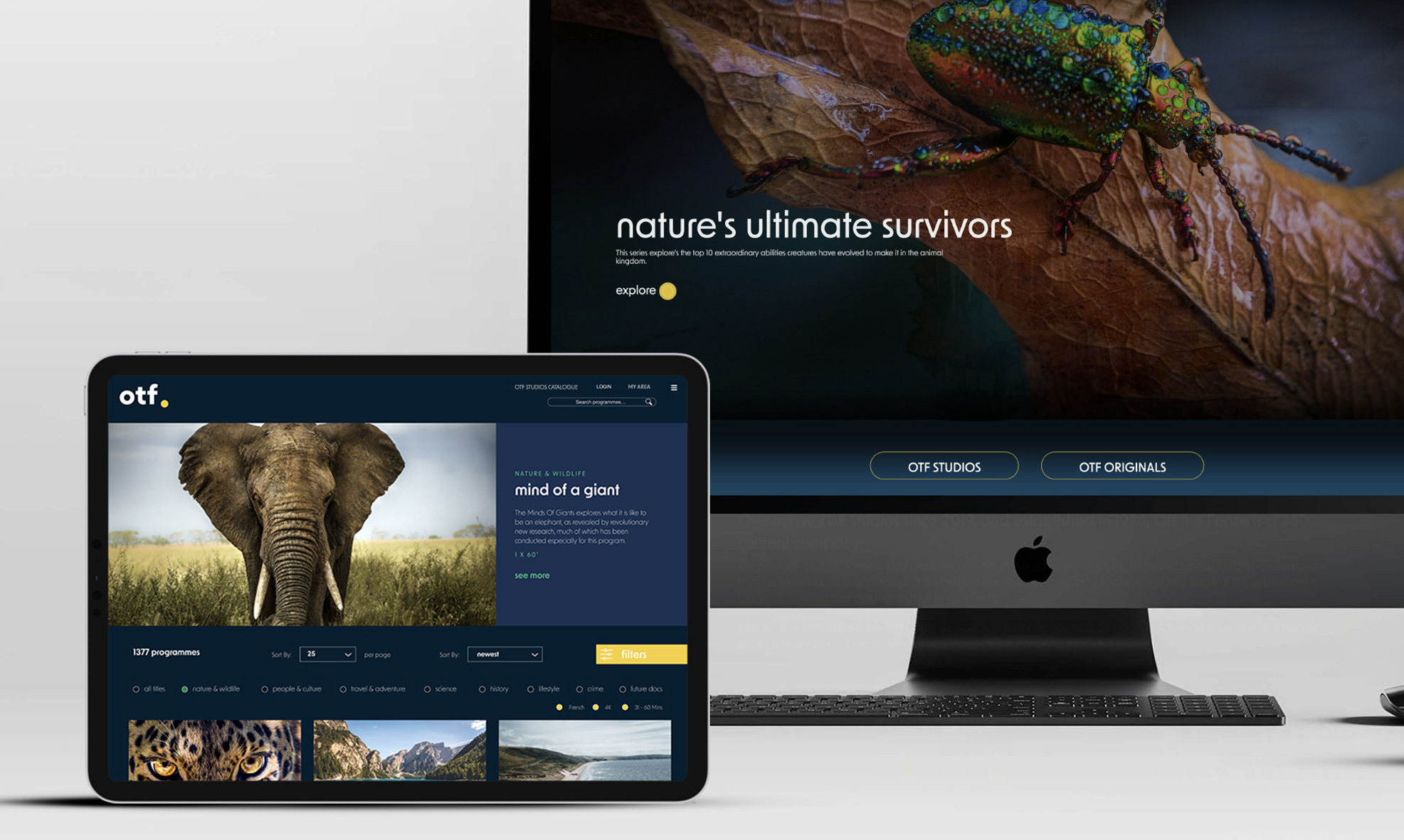
Mindcorp relaunches Off The Fence
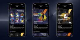
Mindcorp lead in launch of NEW Off the Fence identity and web platform
Mindcorp completed Off the Fence’s overhaul of their new website with new back-end system, front-end design and new features in time for MIPCOM launch.
Over the last 12 months, we have been working closely with the Off the Fence team to help them realise the massive changes going through the company over the last two years.
The work has centred around a thorough overhaul of the back-end, working closely with their sales teams and a complete redesign and front-end UX and UI interface change.
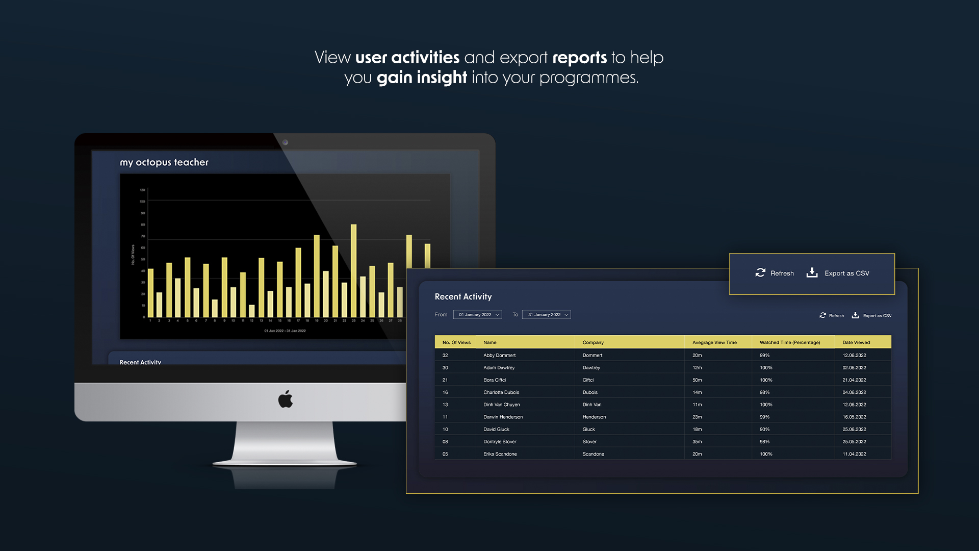
To make this as smooth as possible, Mindcorp have created the best operating software, with newly added features, a completely new back-end interface and functionality.
The creation in this screening systems software has meant that it now carries the most flexibility of design and functionality in the marketplace and at a really competitive monthly price.
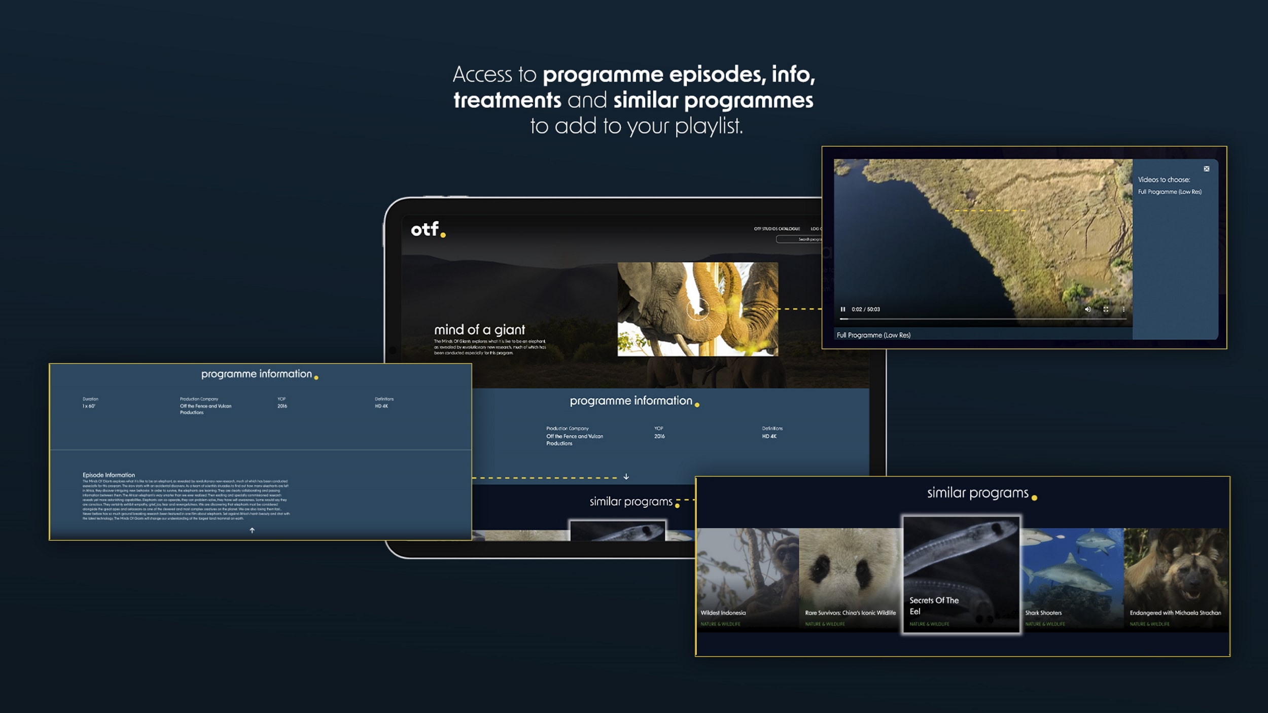
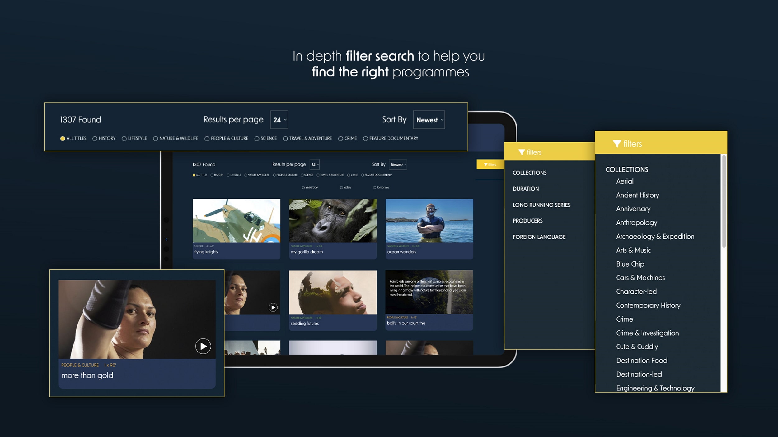
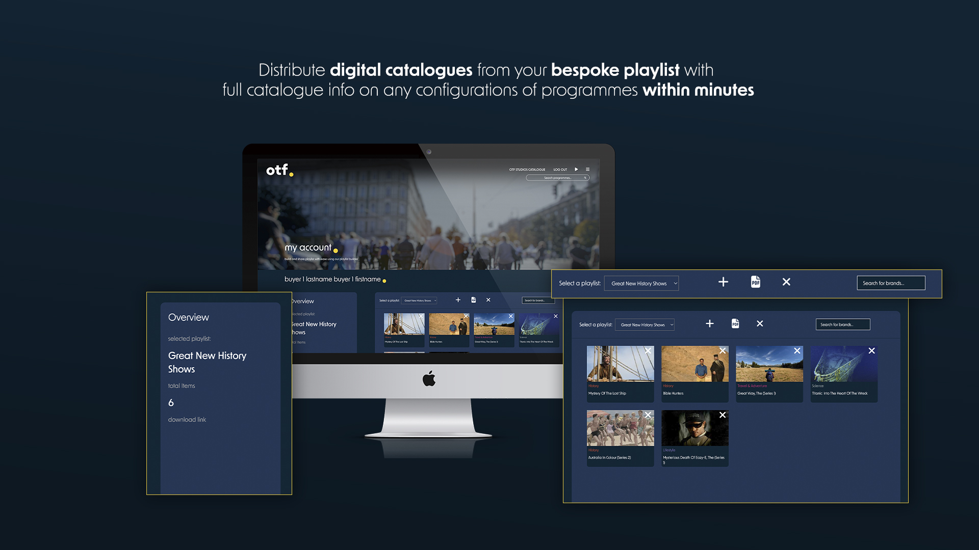
One of the key features in the new software interface is the design of a digital catalogue that can be created and delivered instantly, allowing the sales team to send bespoke playlists with full catalogue info on any configurations of programmes within minutes. With the virtual death of the printed catalogue, the ability to create a bespoke buyers playlist and catalogue on-the-fly is key.
Mindcorp have also created other key pieces of TV business in the last few months and have launched the new Off the Fence platform and identity, to get companies thinking about their own identity and digital delivery.
If you wish to have a demonstration of the screening system, please contact:
Andrew: andrew@mindcorp.co.uk
Craig Rathbone: craig@mindcorp.co.uk
Off The Fence Identity Refresh
Off The Fence
Client: Off the Fence (OTF)
Type: Corporate Identity
In 2020, Off the Fence came to us for a revamp of their website, which was launched for MIPCOM 2022 and had outstanding feedback. Visit Mindcorp relaunches Off The Fence page to see the final outcome.
However, we believe that a brand needs more than a new website. It needs a refresh on the identity and branding to coincide with the website’s new look. So, we created a upgraded logo for Off The Fence.
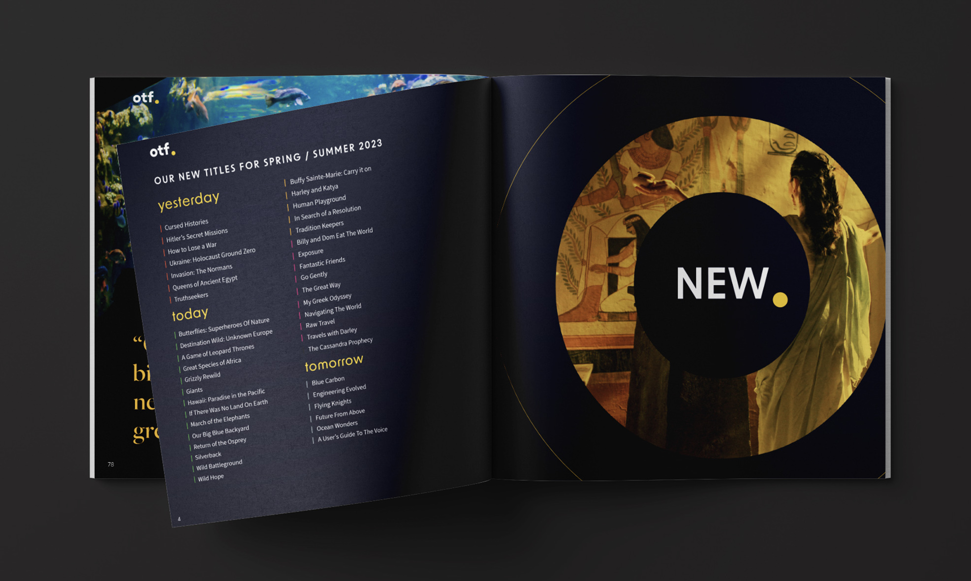
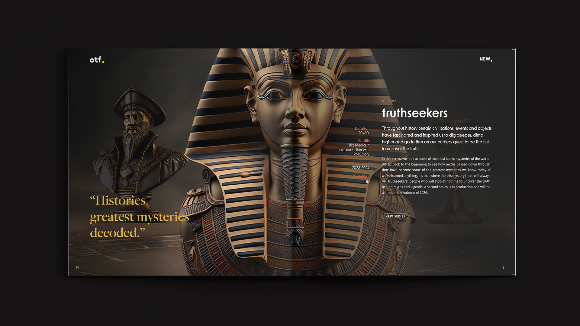
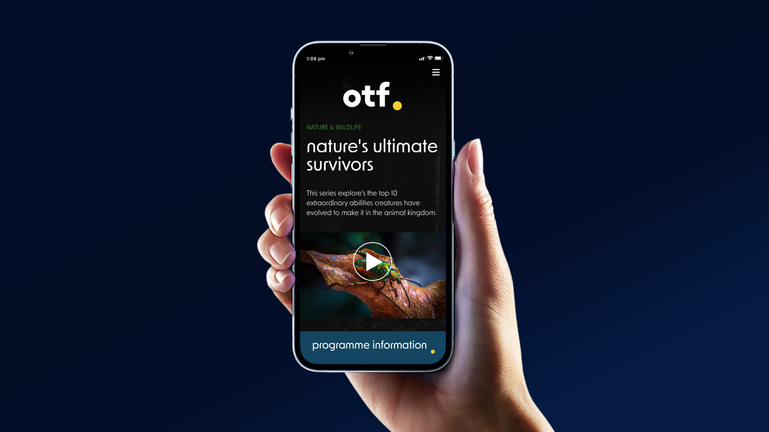
Additionally, OTF’s brand required an animated logo to explain its origin and represent their three main genre categories, ‘yesterday’, ‘today’ and ‘tomorrow’. We started off with a storyboard and then began the animation process on After Effects. The goal was to use the yellow dot as a gate way for the genres and tie it all together at the end by it joining the logo.
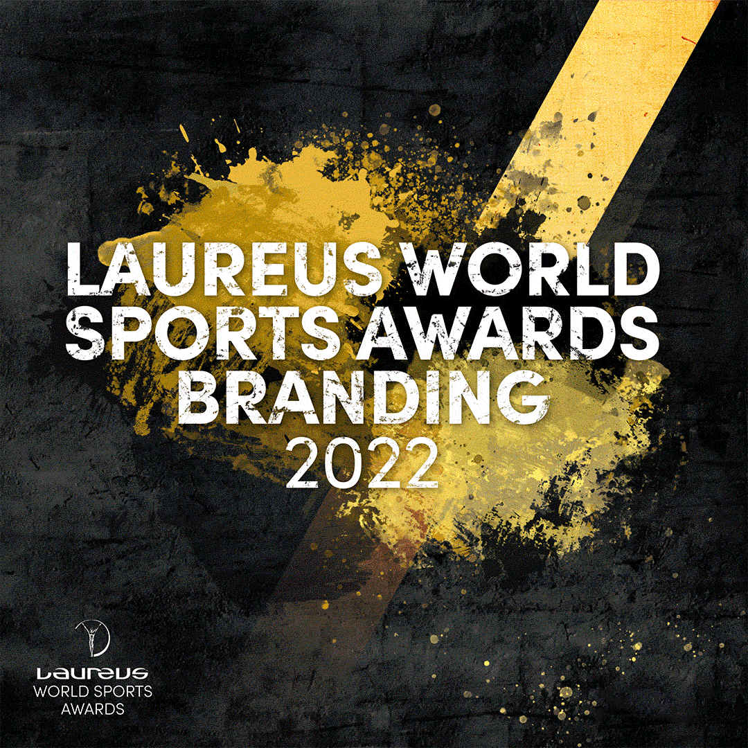
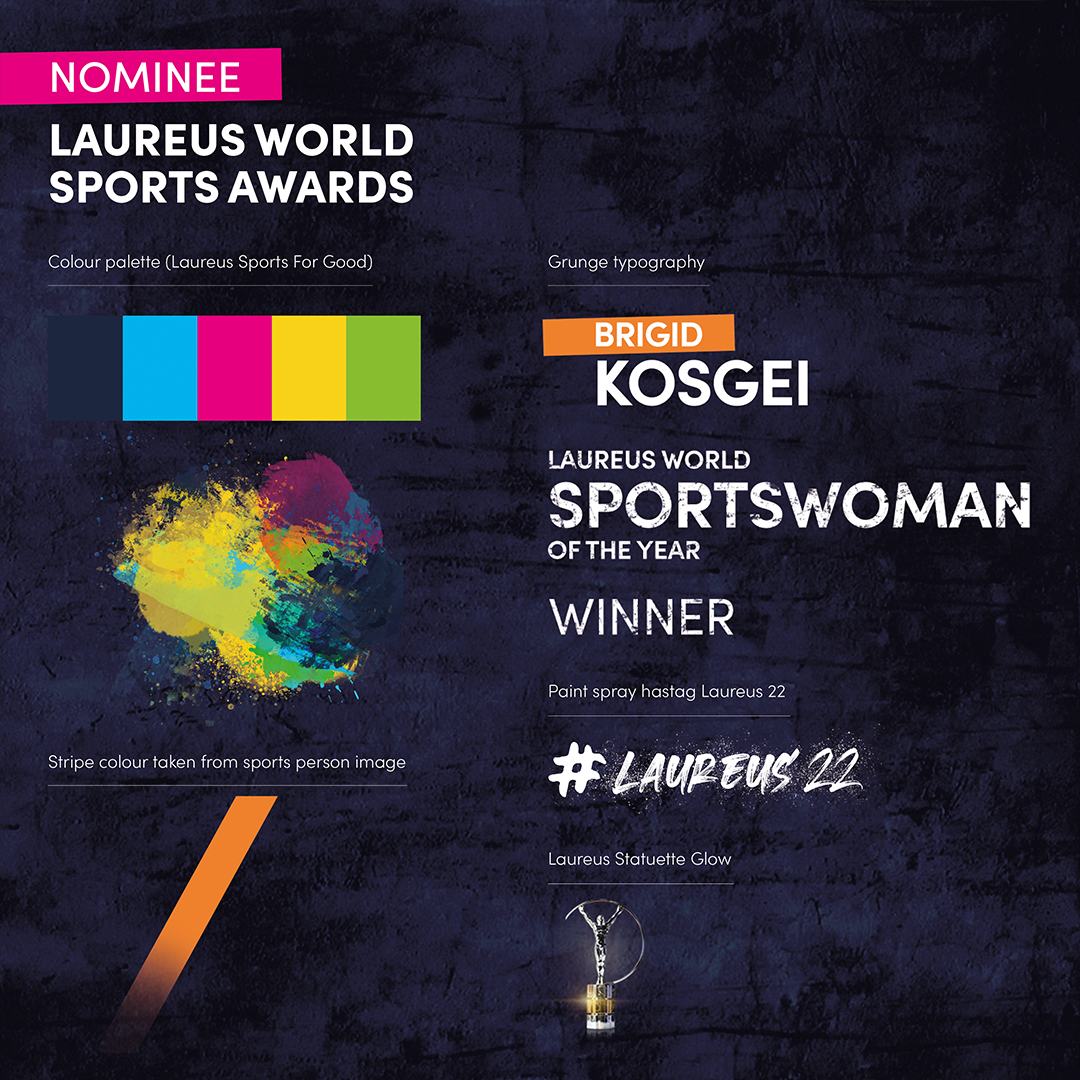
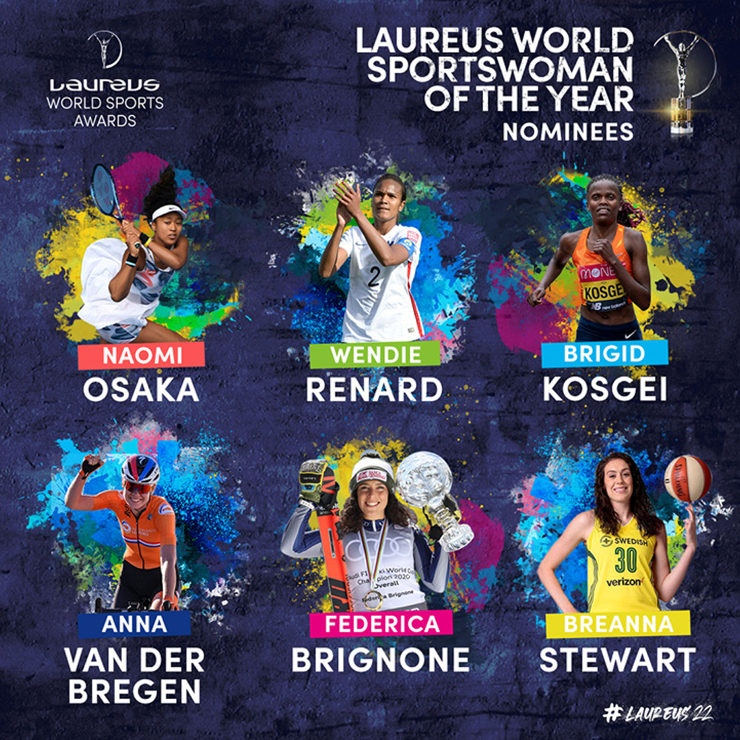
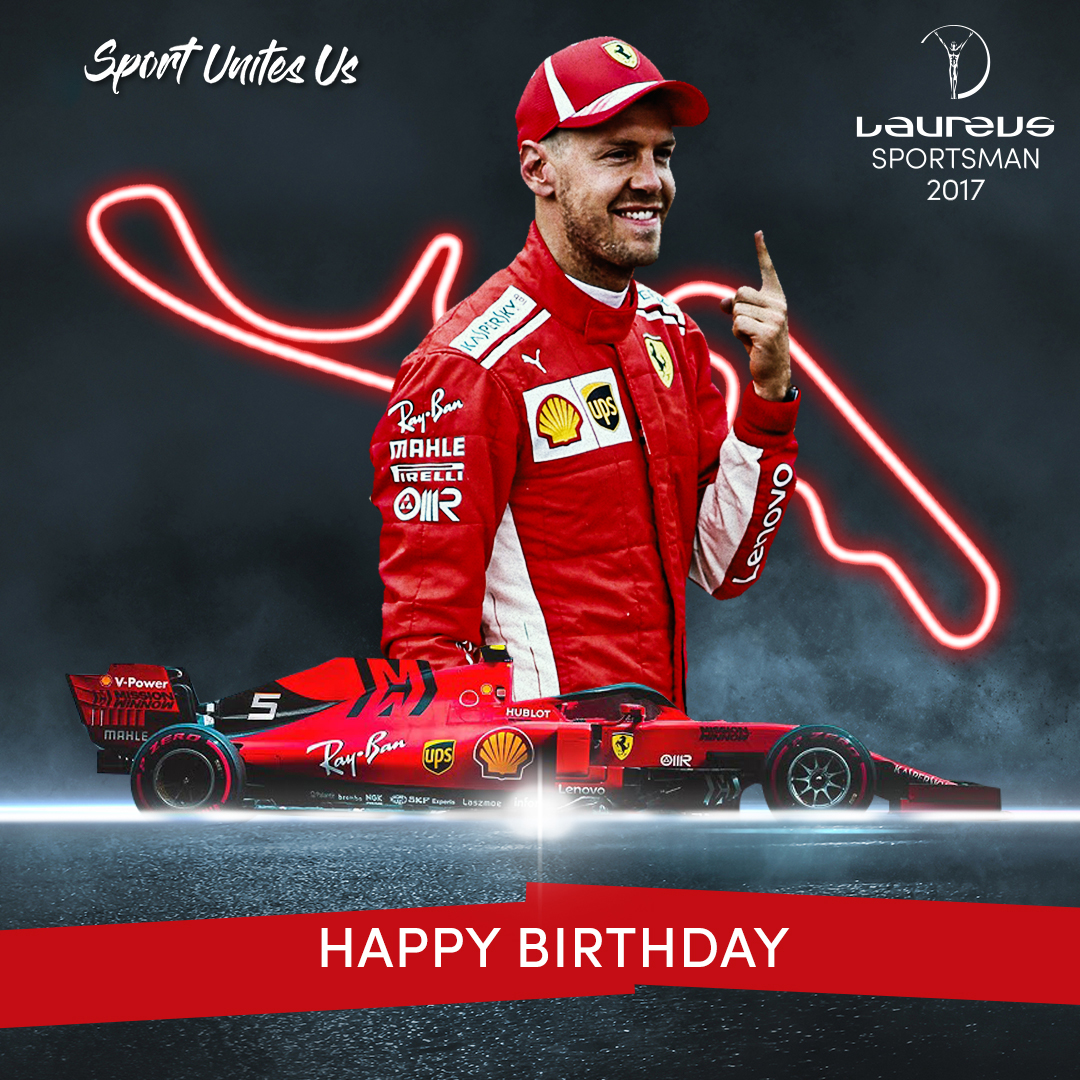
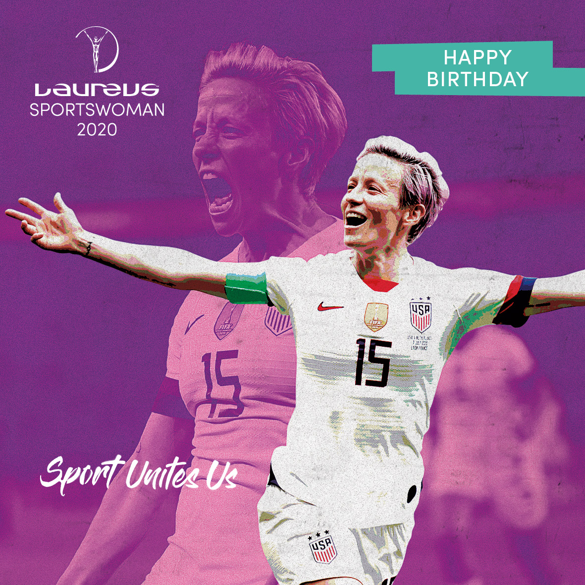
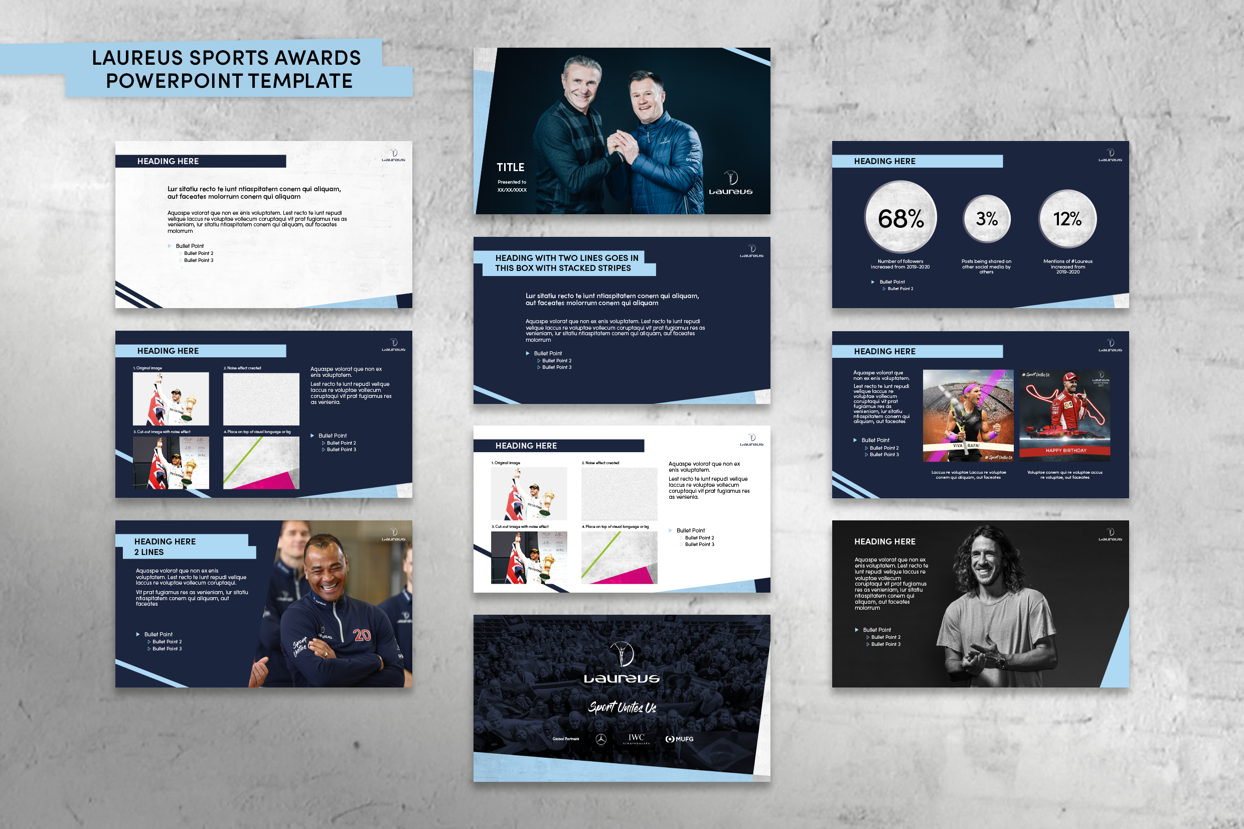
Laureus World Sports Awards Branding
Laureus
Client: Laureus
Type: Branding
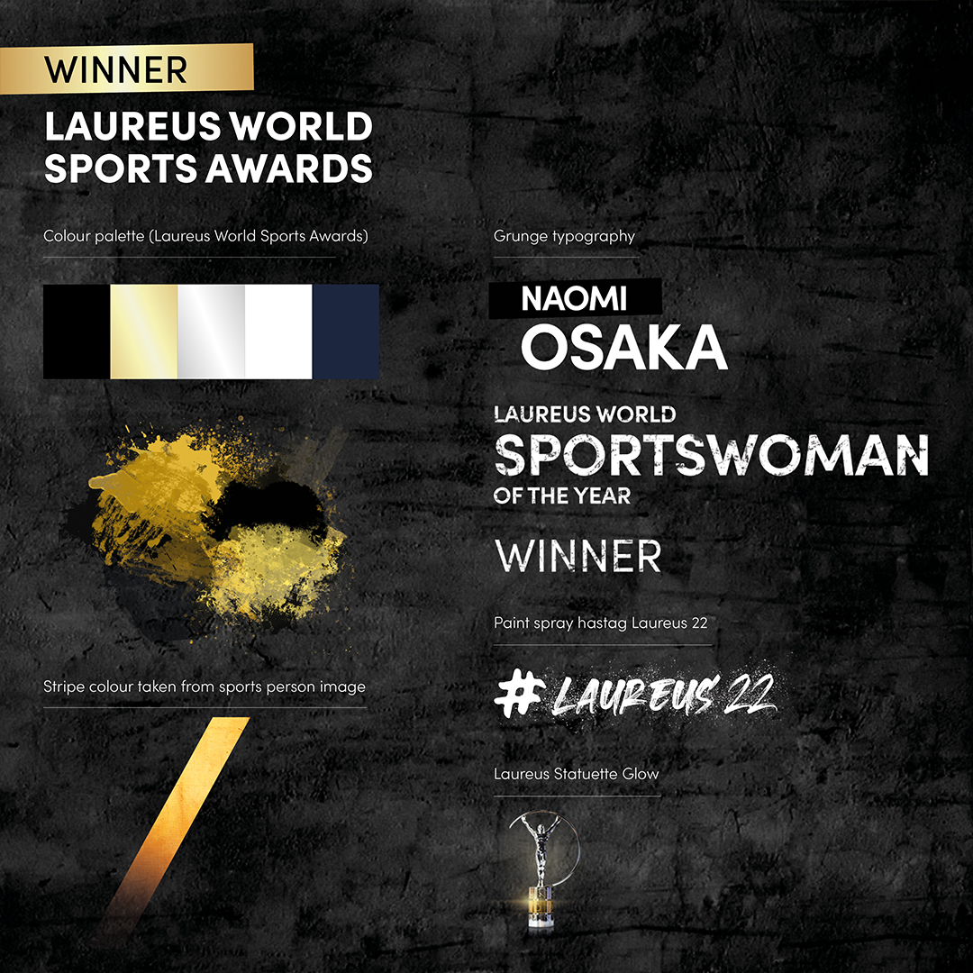
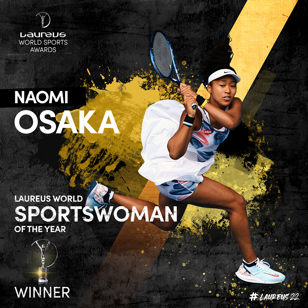
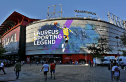
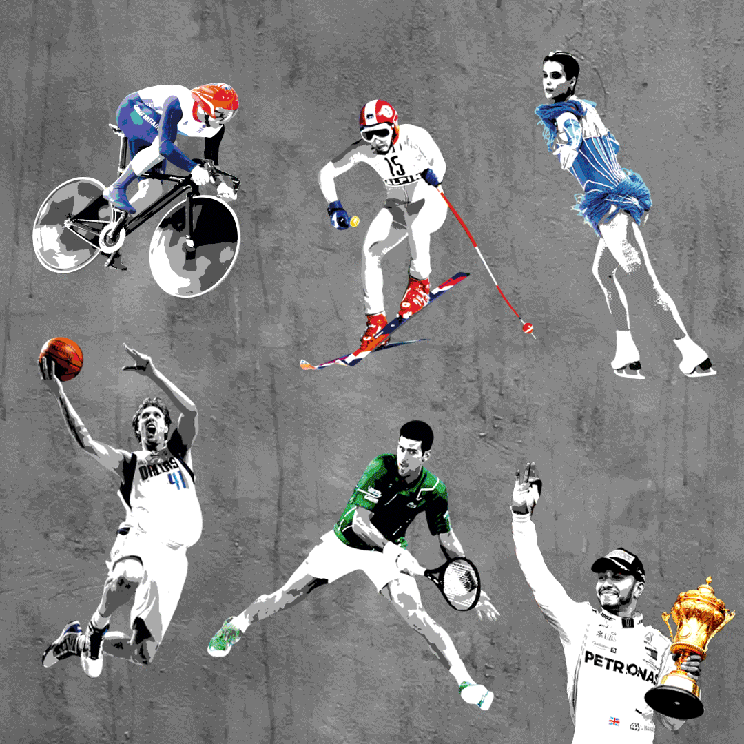
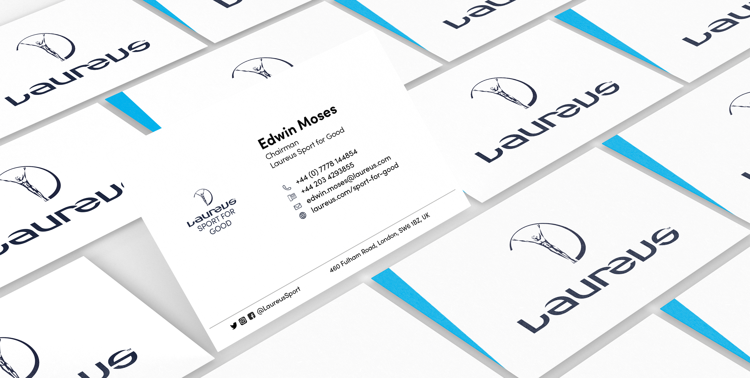
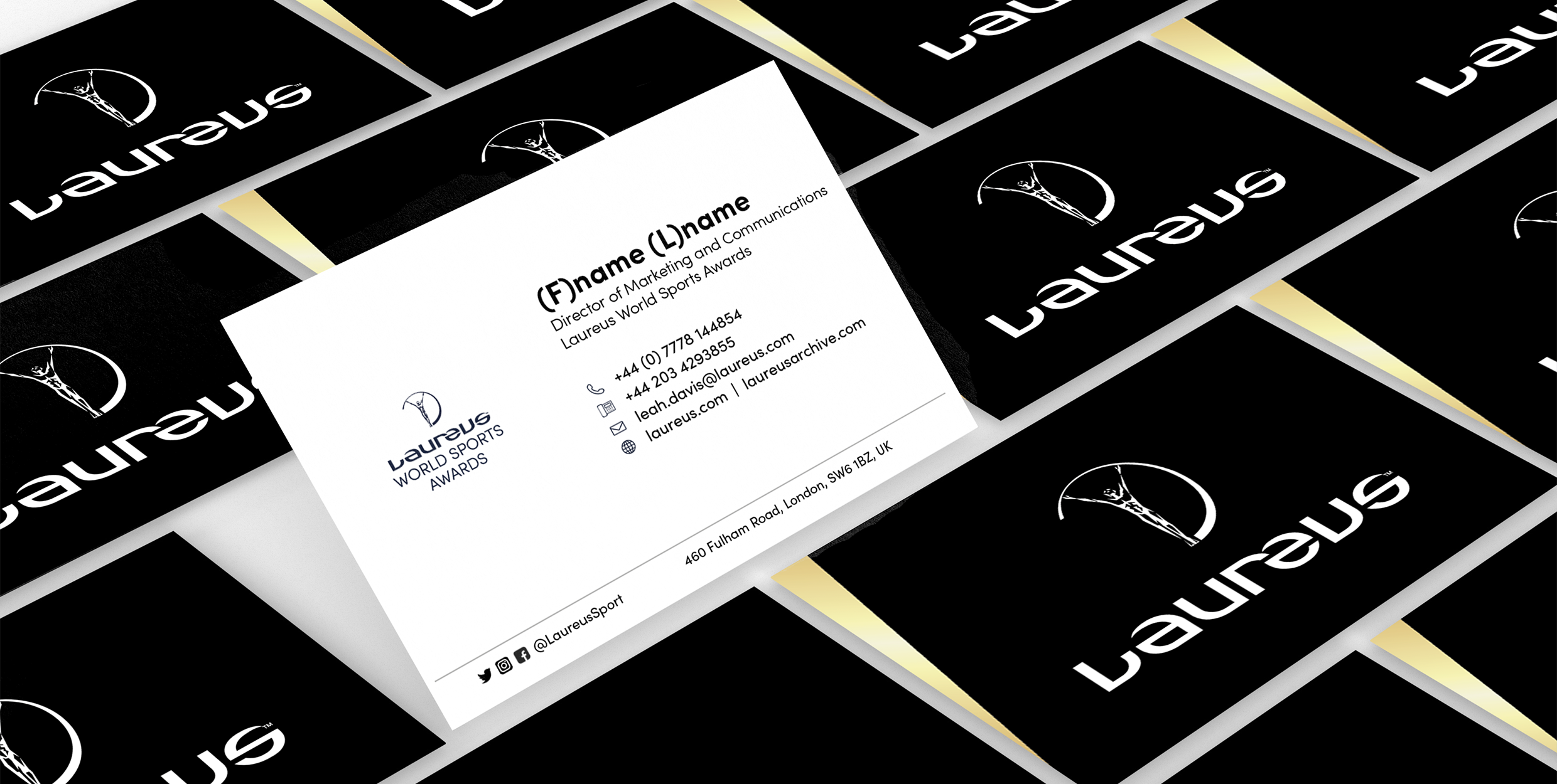
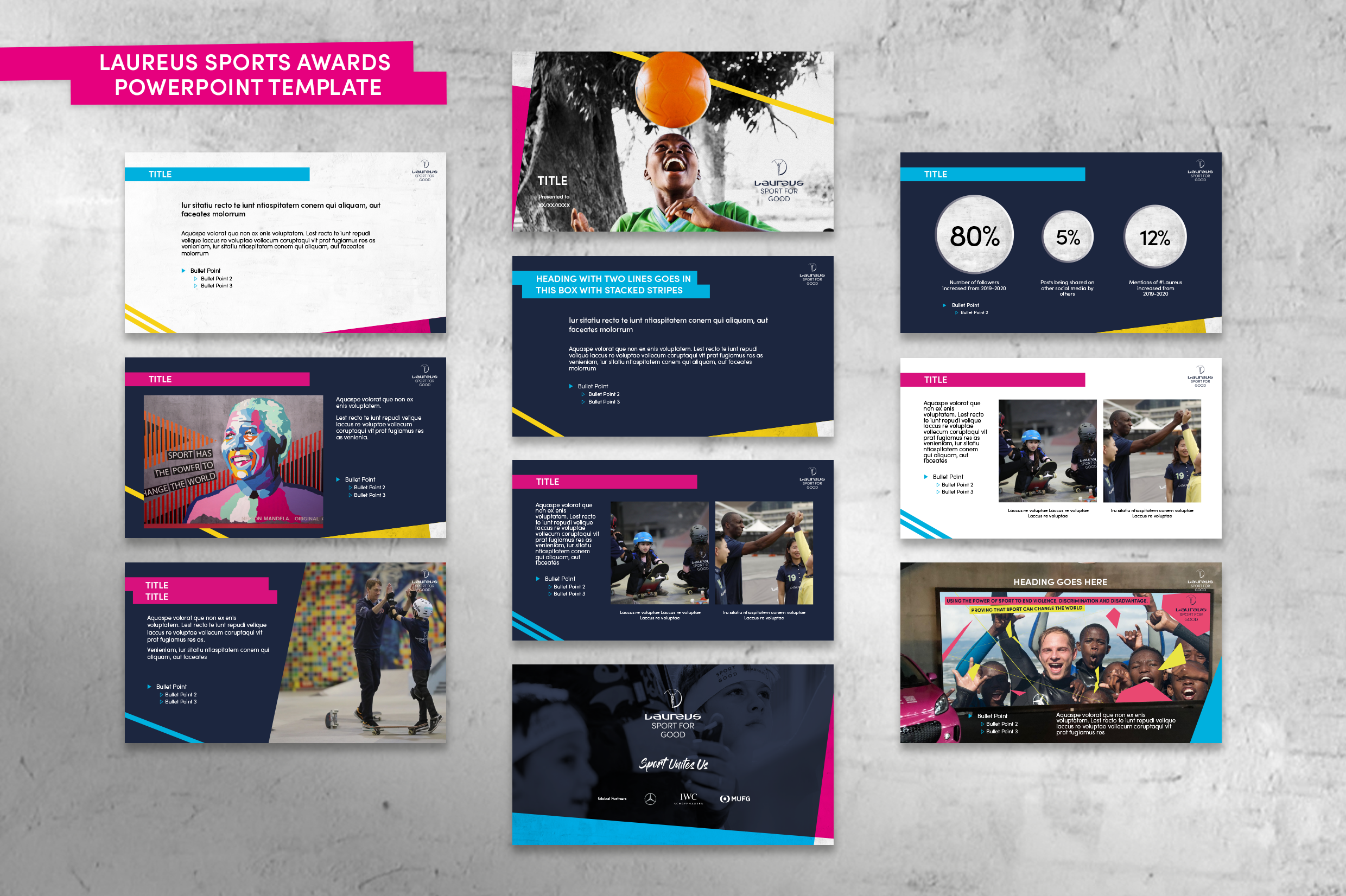
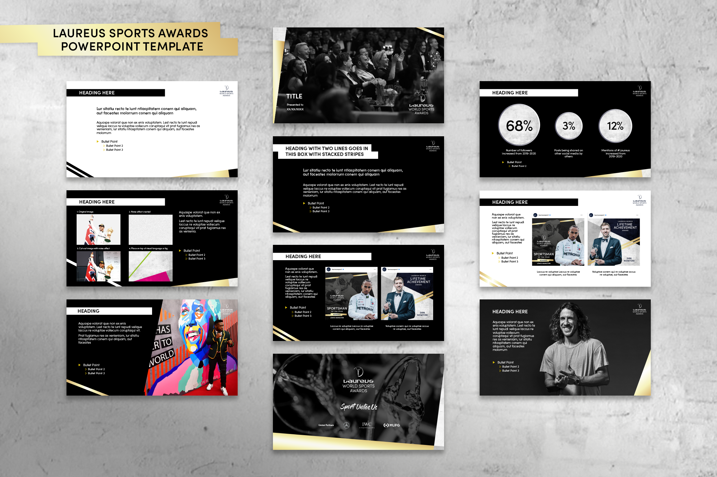
2022 Laureus World Sports Awards honour individuals and teams from the world of sports along with sporting achievements throughout the year. Laureus was looking for a creative agency to develop the 2022 Awards look and feel, which would later be applied across all digital Awards brand outputs.
We were tasked to develop the Berlin 2020 Awards identity, as it had outstanding responses and paved the way for a new look for the awards, that strays away from the traditional corporate feel.
Some graphic elements were derived from previous year’s awards to bring a sense of union and togetherness. We introduced grunge typography and paint splatter to reflect the rawness and dynamism of sports using colour palettes from Laureus World Sports Awards and Laureus Sports For Good. Even though the 2022 awards show was purely digital, we wanted to emulate the feeling of a live show by creating graphics on buildings and monuments.

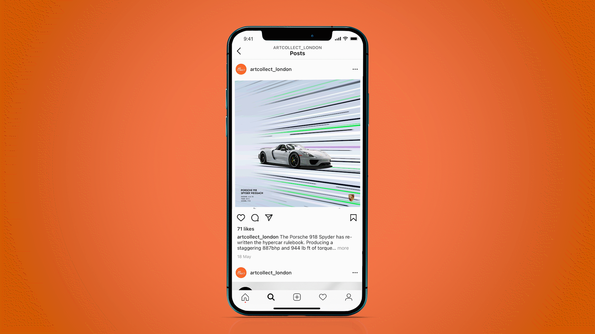
Art Collect
Art Collect
Client: Artcollect
Type: Branding and Corporate Identity
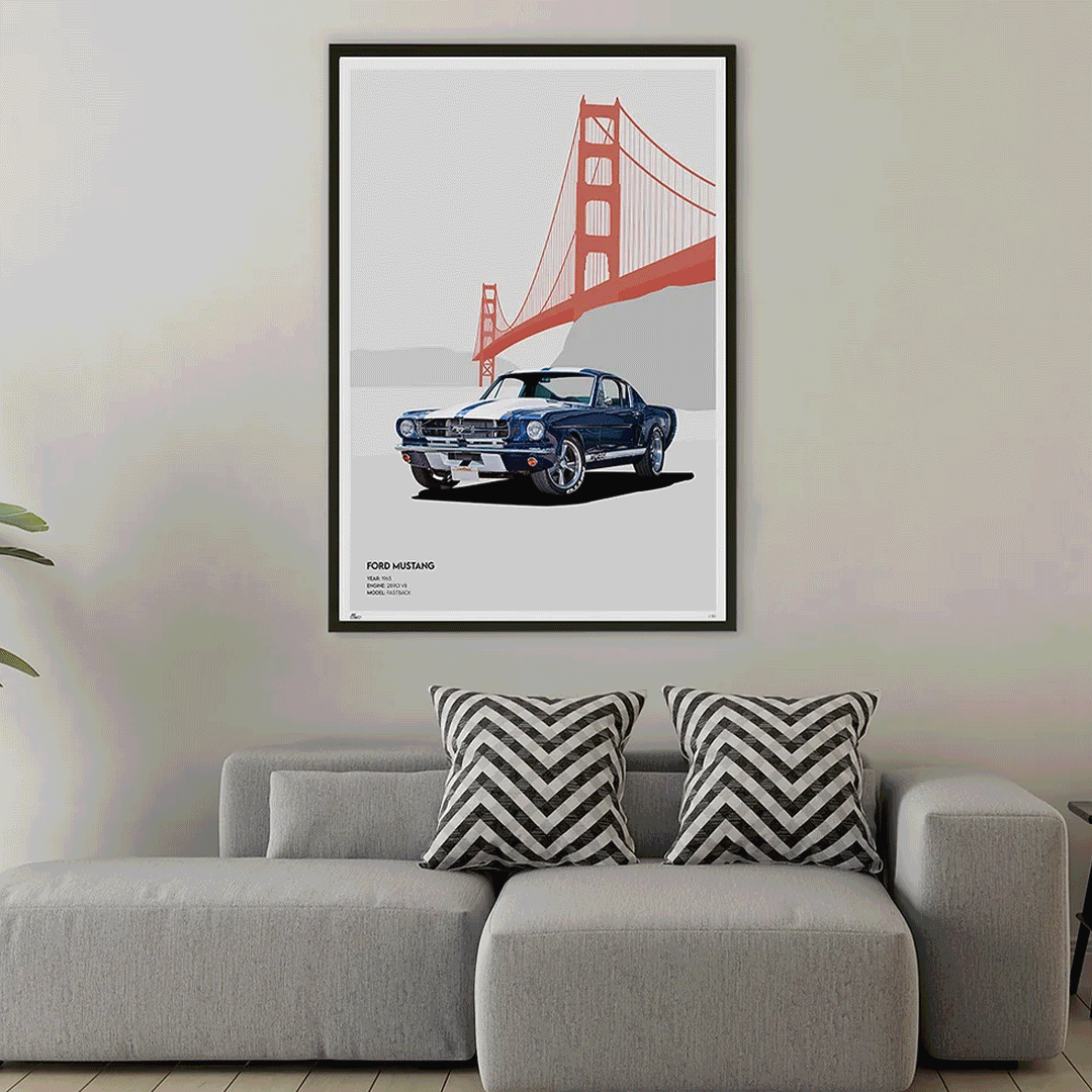
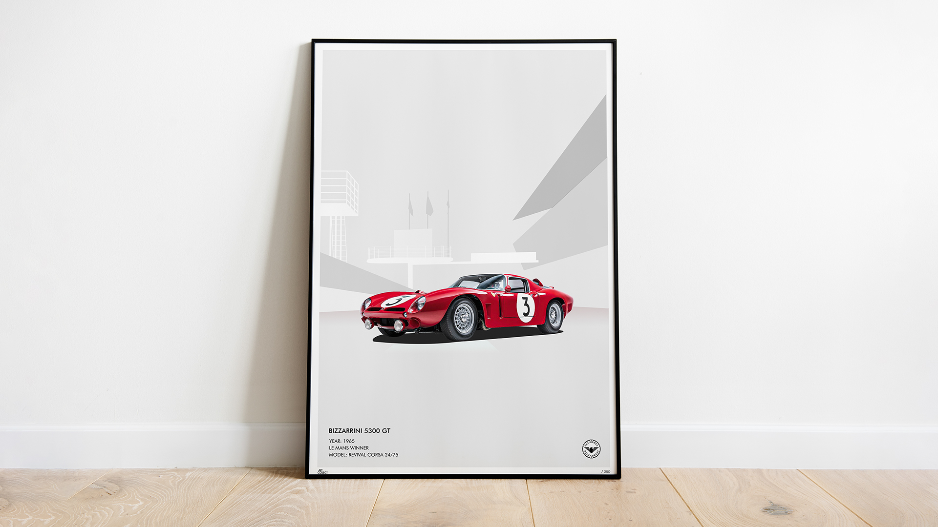
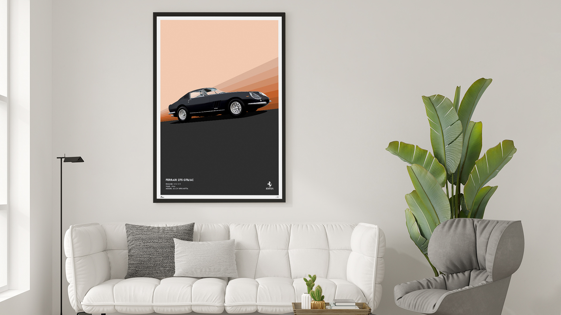
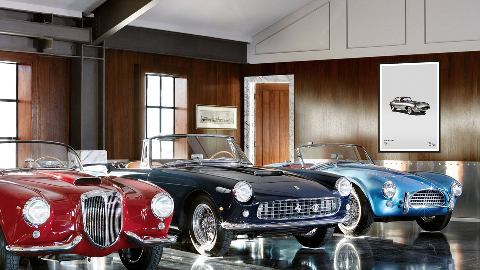
Art Collect is where you will find all of the best car art designs, created by a team of designers. The car art posters are the highest quality museum prints. Art Collect take on individual commissions from car owners and a one-off exclusive piece of bespoke car requested by the buyer.
Our brief was to create a new brand launch and identity to promote and introduce their business to the niche market of classic car collectors/enthusiasts. We successfully carried out the brief and provided the client a logo, visual language, website, social media and marketing campaign to promote Art Collect.

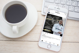
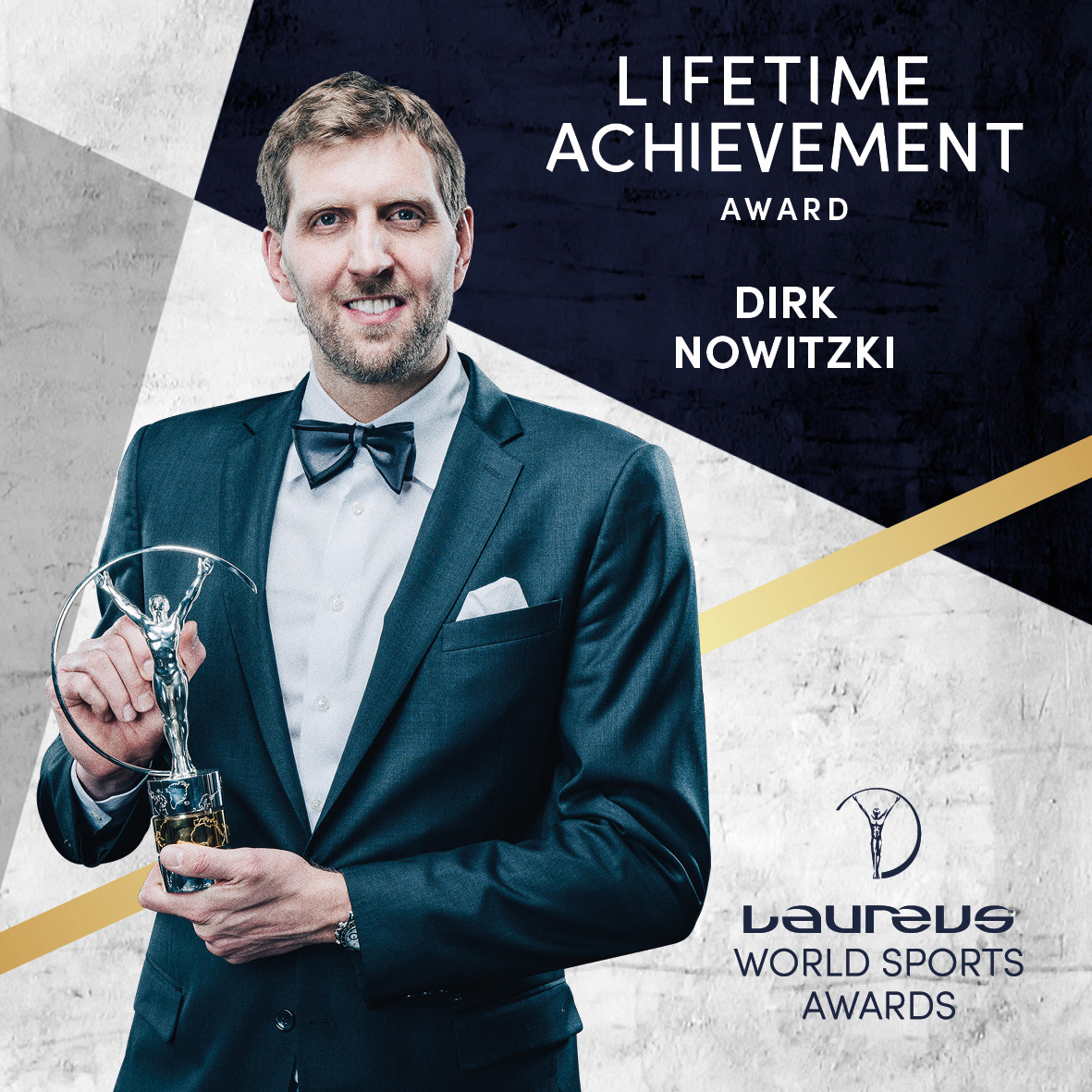
Laureus Rebranding Implementation
Laureus Rebranding Implementation
Client: Laureus
Type: Branding
The task was to rebrand Laureus. We wanted to create something dynamic and fun, whilst reflecting the brand identity and its sub-brands.
The rebranding included a Laureus brand book, print and digital assets, social media and other applications. The overall look and feel reflects Laureus as strong, vibrant and united.


Laureus Rebranding
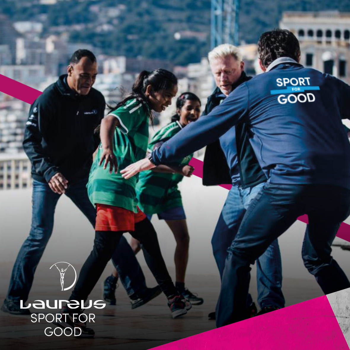
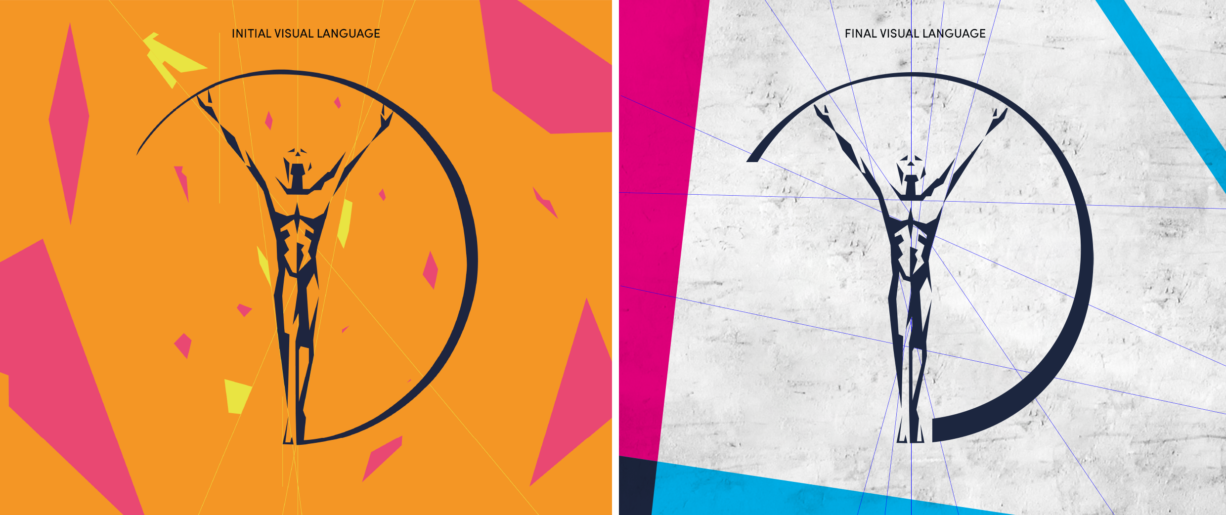
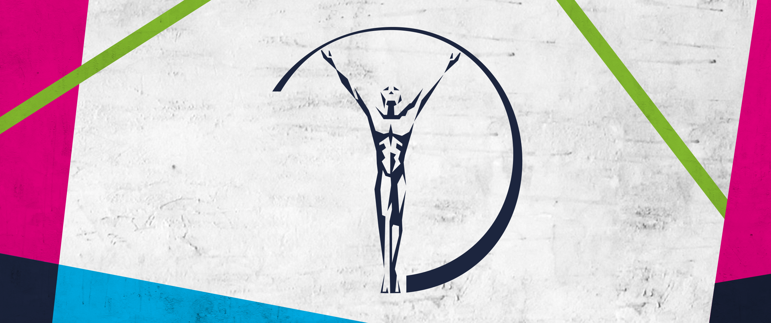
Laureus Rebranding
Client: Laureus
Type: Branding
The task was to rebrand Laureus. We wanted to create something dynamic and fun, whilst reflecting the brand identity and its sub-brands.
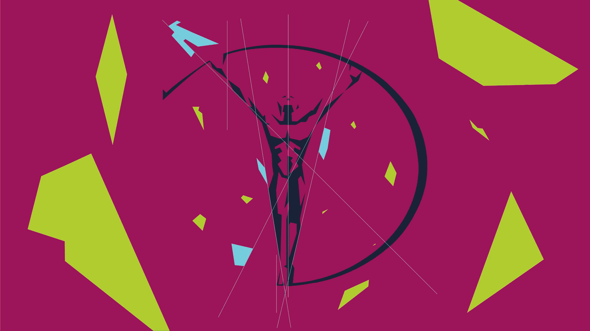
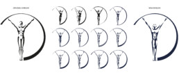
The Laureus logo was modified to be bolder and stronger. One of the important things to get right was recreating the emblem, so there were many development stages. We based our branding from the angles that existed in the emblem. To add character and brand the typography as Laureus, we used an angle from the emblem to slash off the bottom foot on certain letters.
The overall branding includes angled shapes and stripes to add an urban feel and portray the colour palettes from each sub-genre tastefully.
We created a separate Sport for Good logo to be used for physical branding purposes such as, on clothes, on event banners or the hood of a car. This way it increases the spread of the brand identity.
Click here to see the final implementation of the Laureus rebrand.

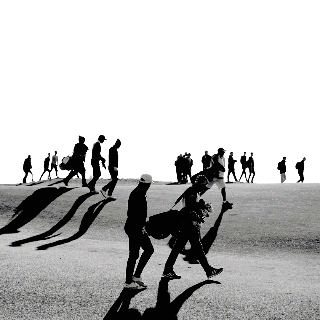
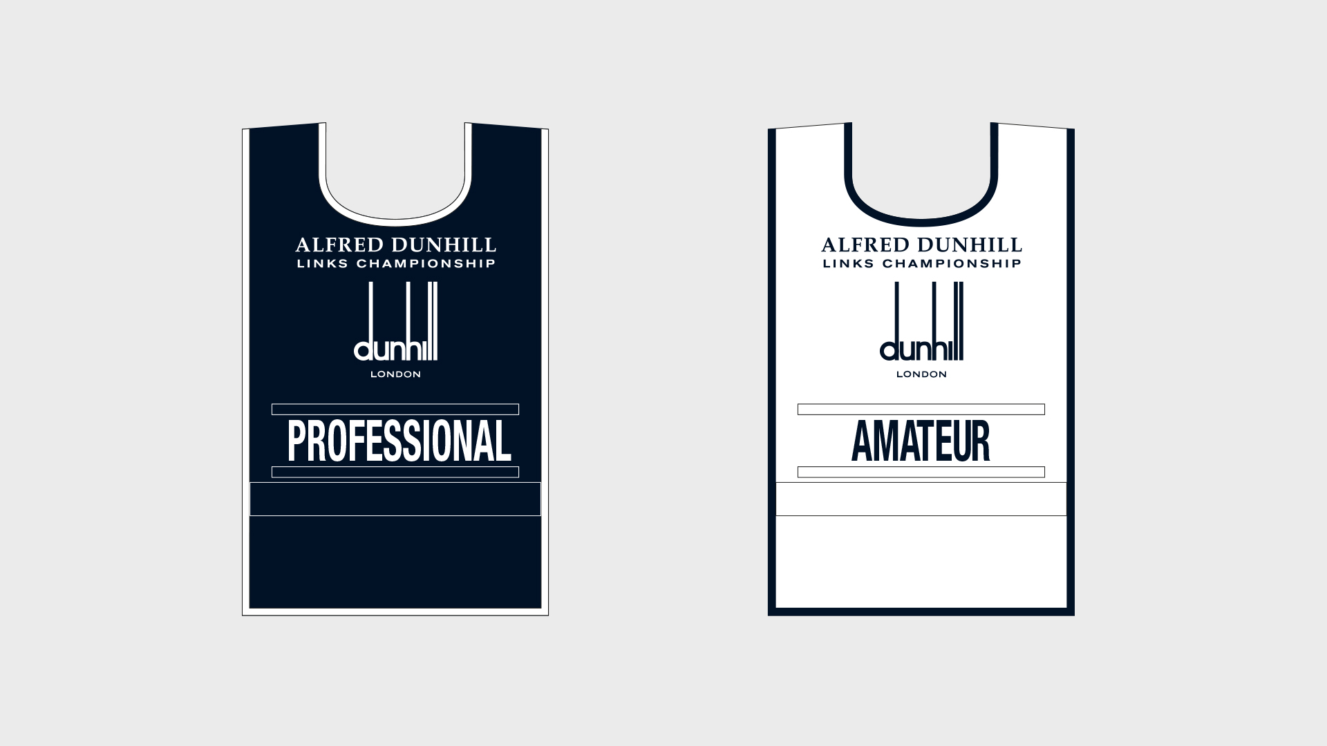
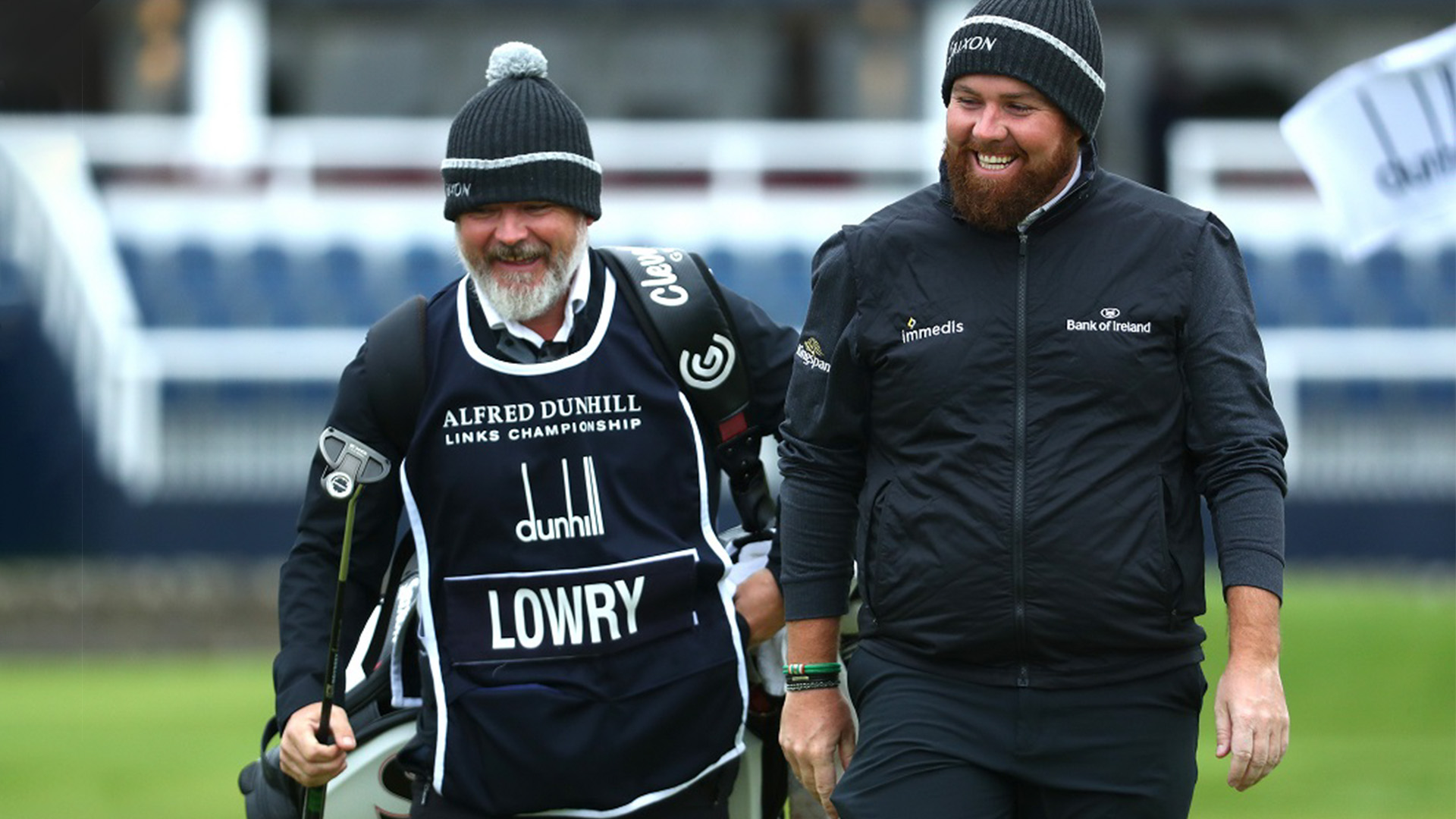
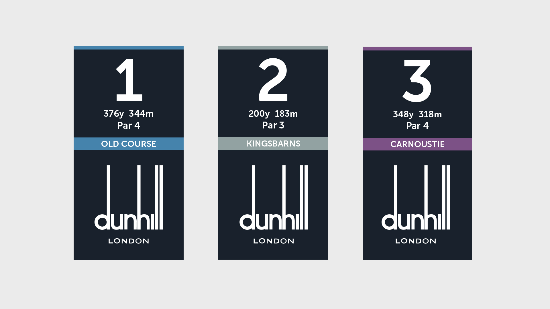
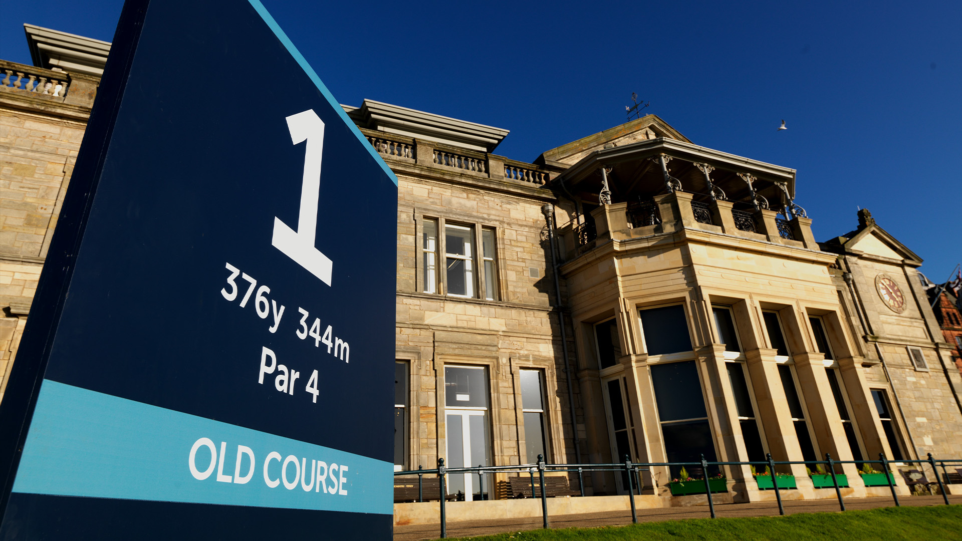
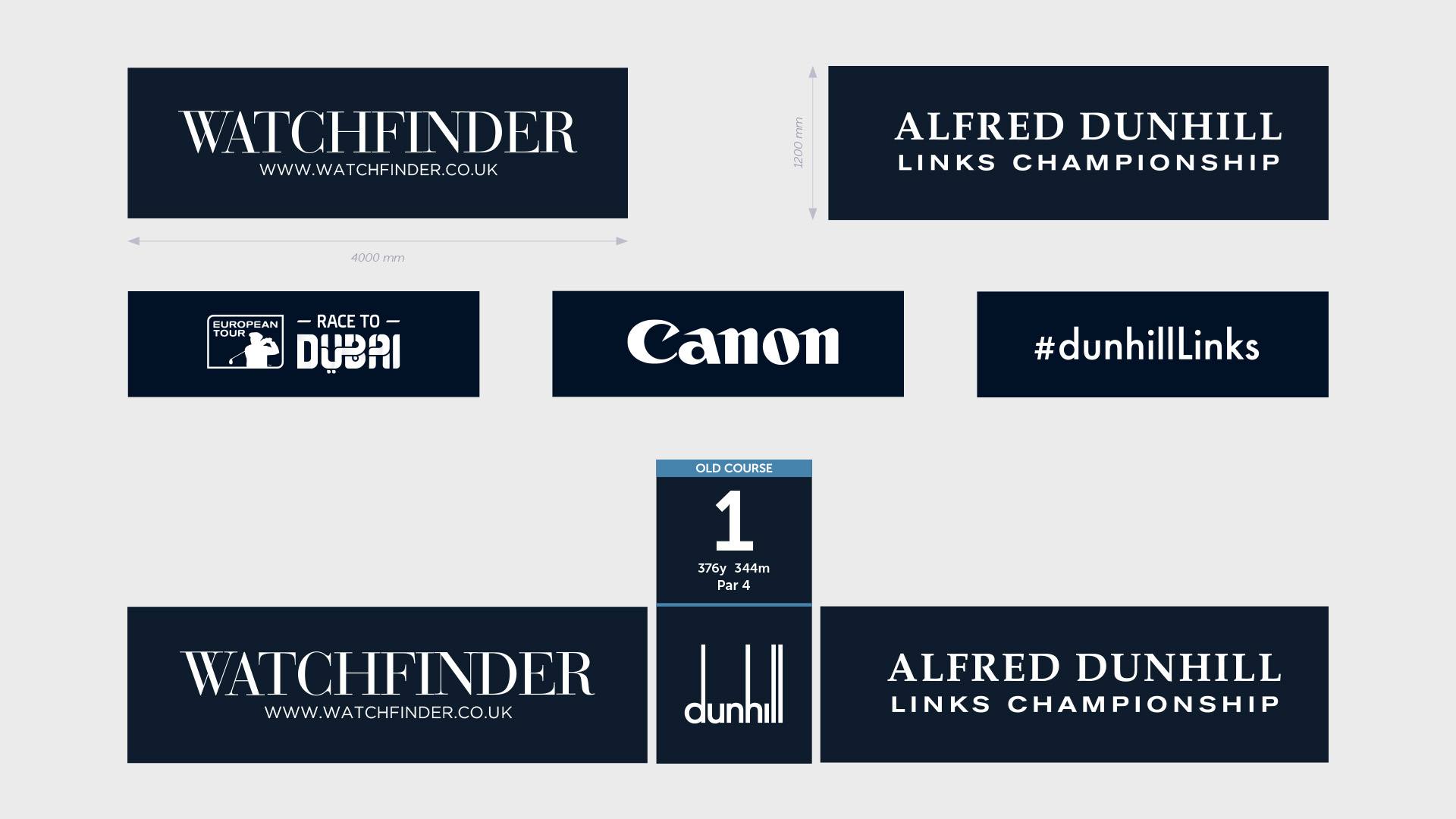
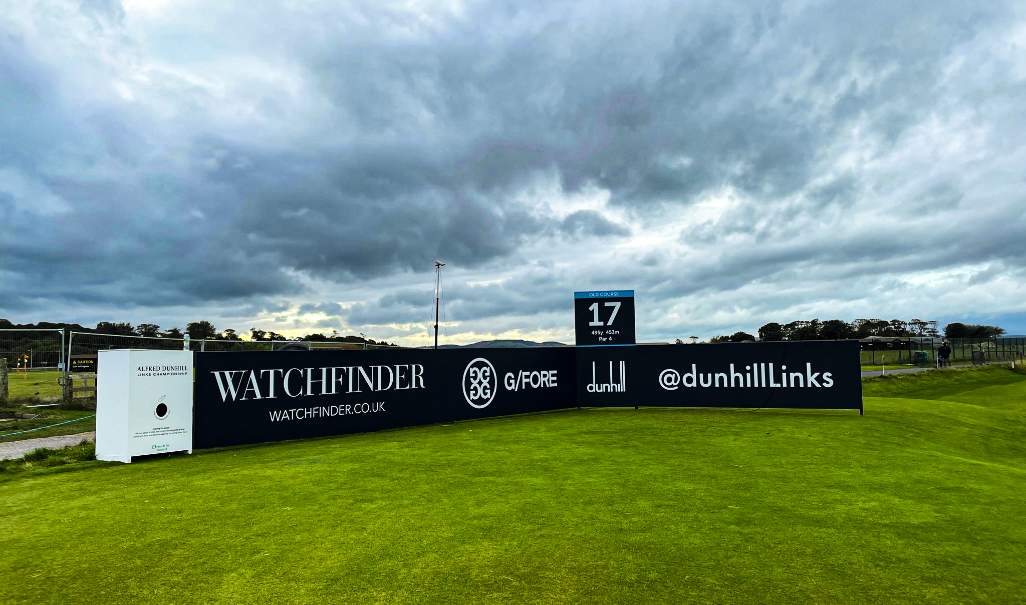
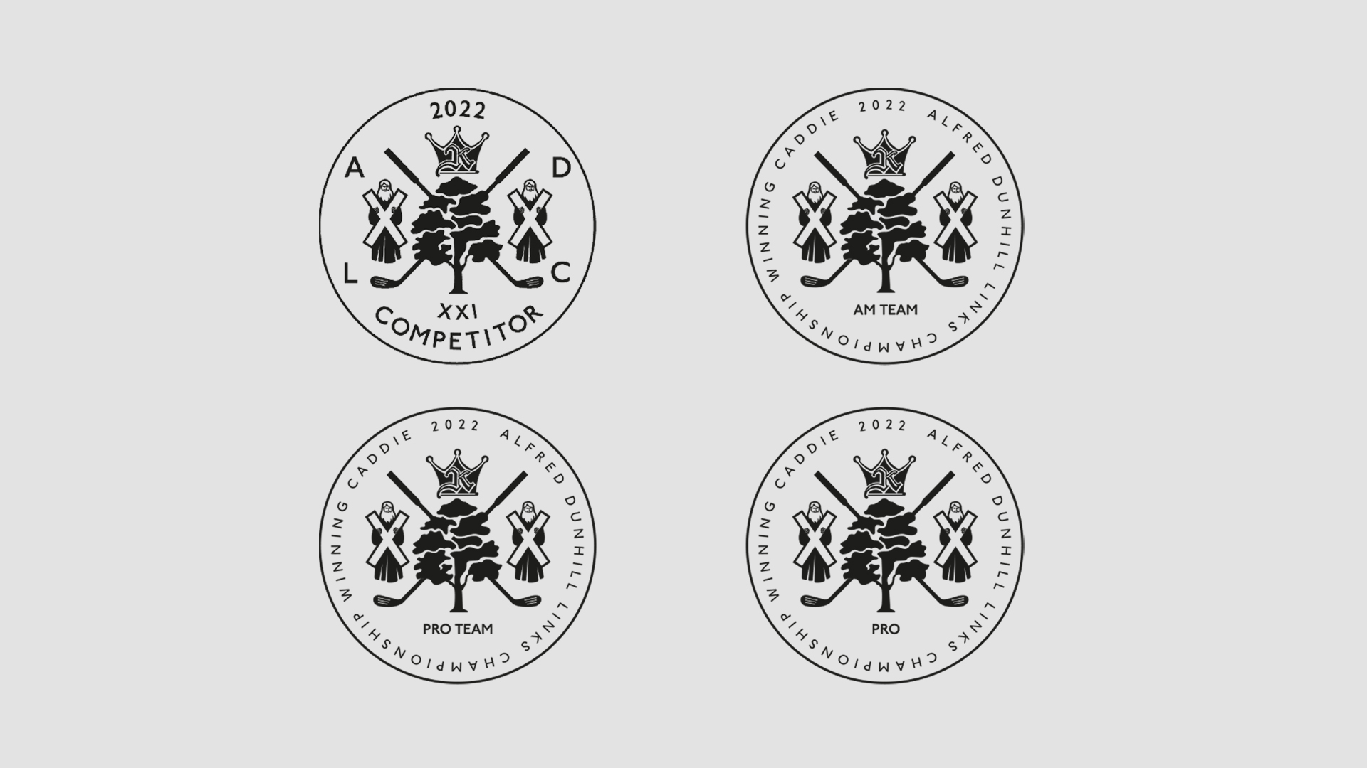
Alfred Dunhill Links Championship
Alfred Dunhill Links Championship
Client: Alfred Dunhill
Type: Branding
We have had 17 years working with Alfred Dunhill Links Championship on behalf of the Richemont Group of Luxury Brands.
The golf tournament is held at St Andrews in Scotland, with two other courses at Carnoustie and Kings Barns. While working with ADLC we refreshed the brand identity, created all on course branding, including sponsor areas and developed their website, digital marketing and social media.
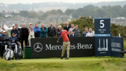
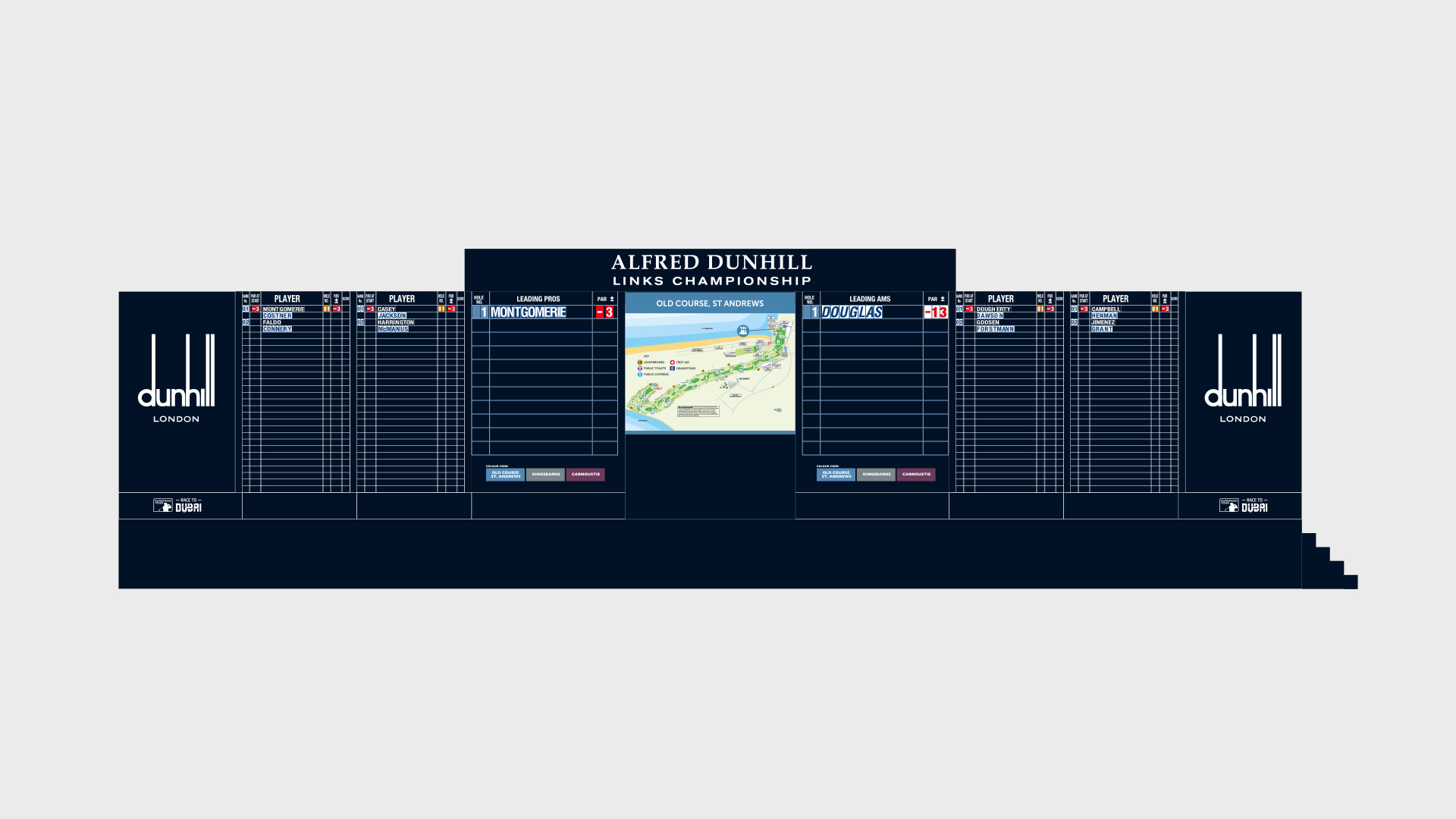
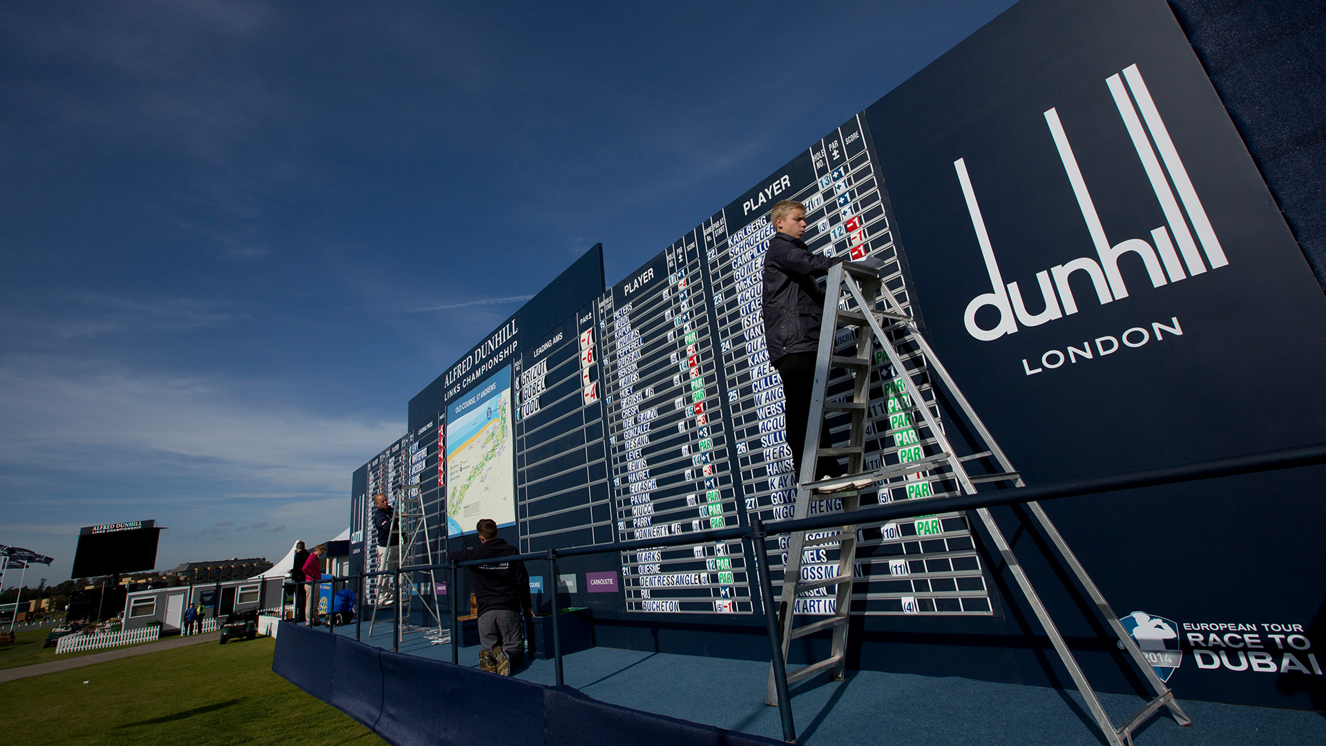
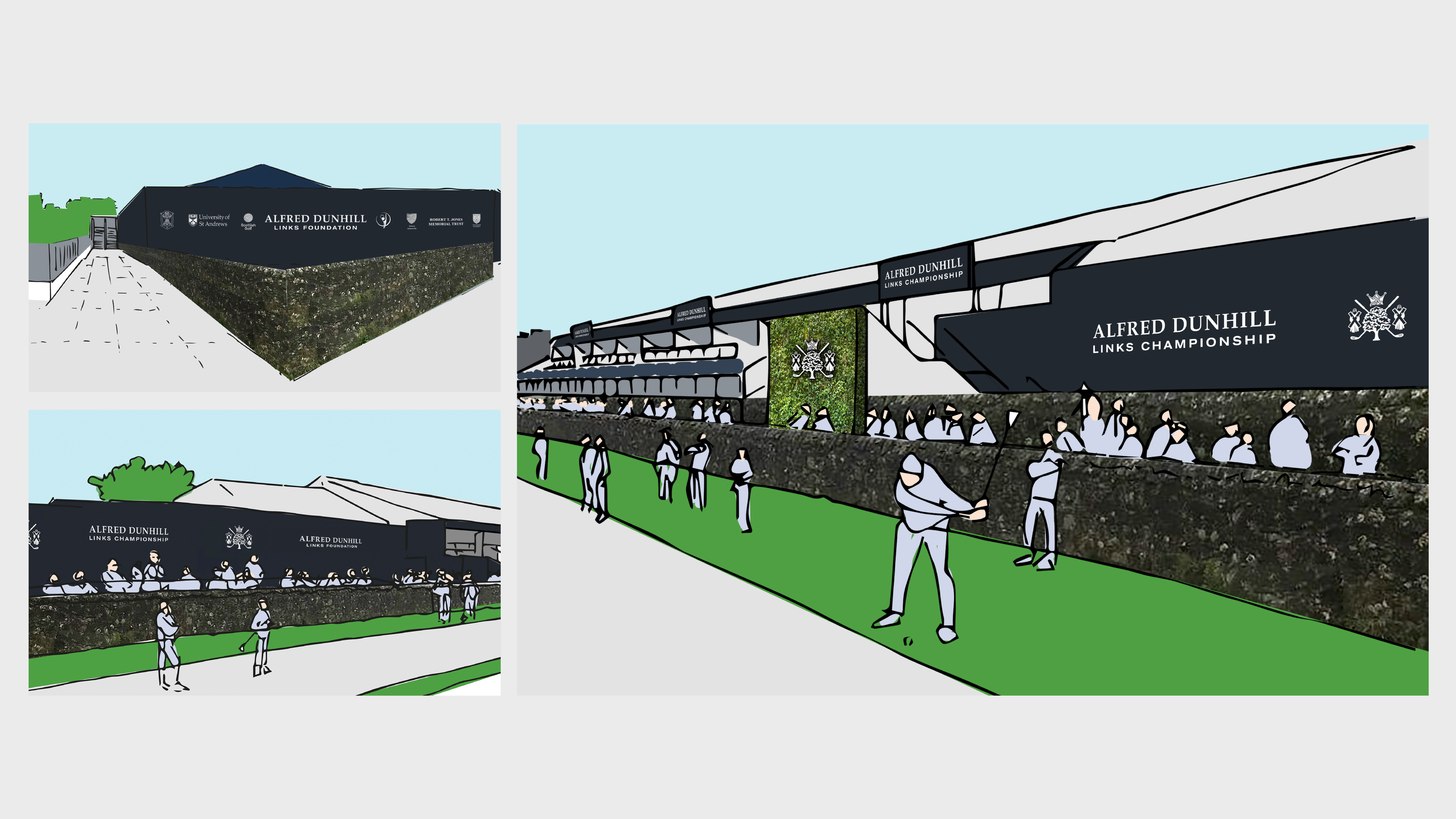
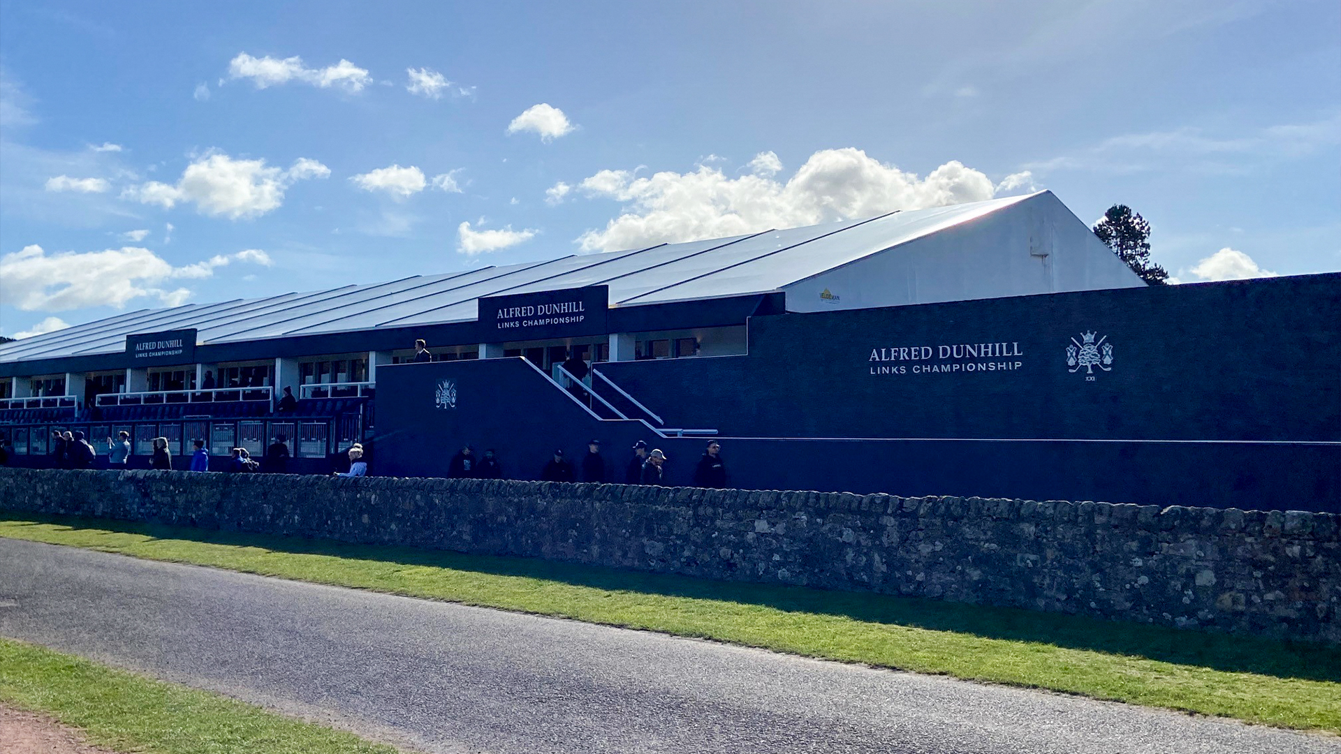
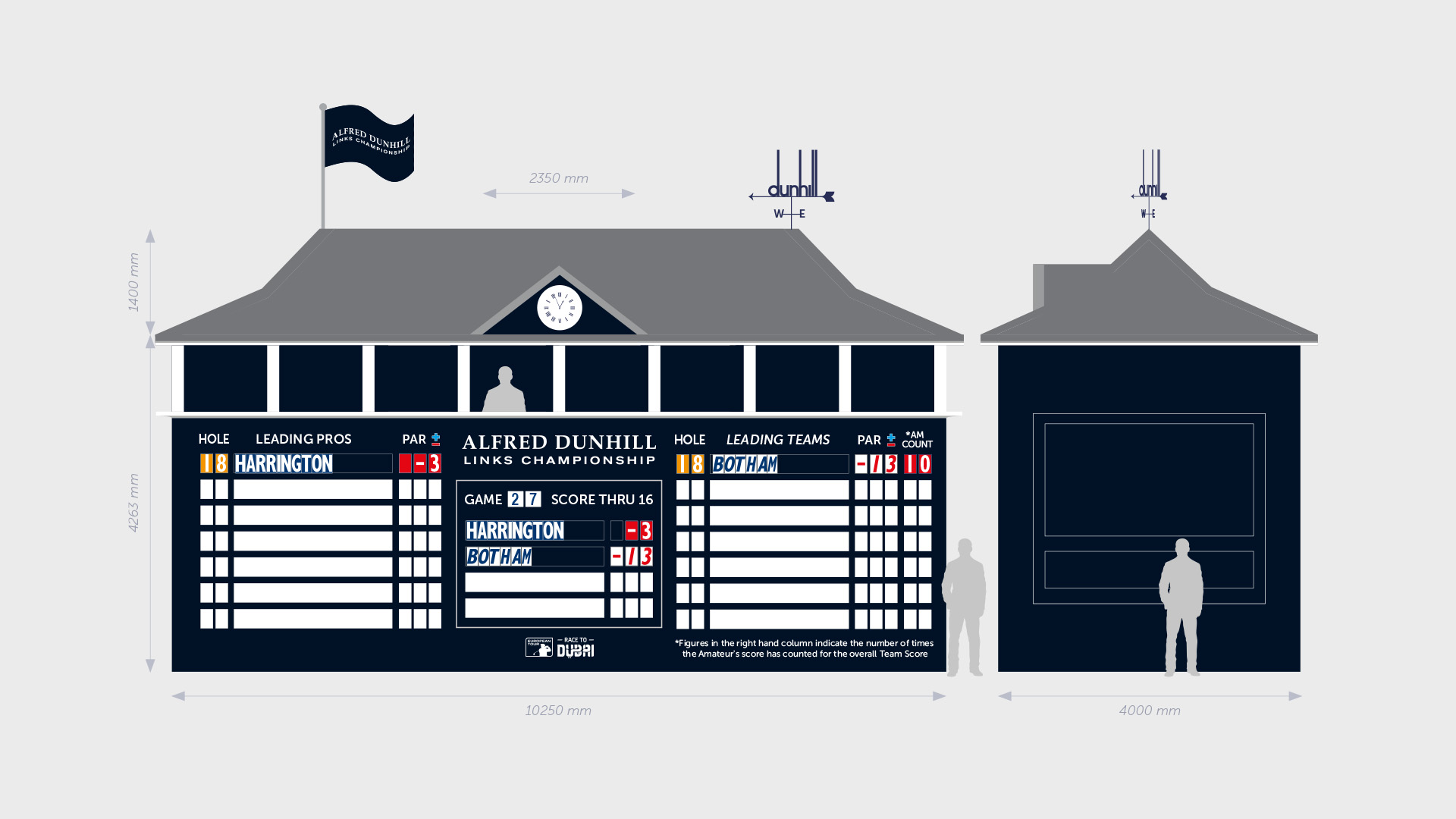
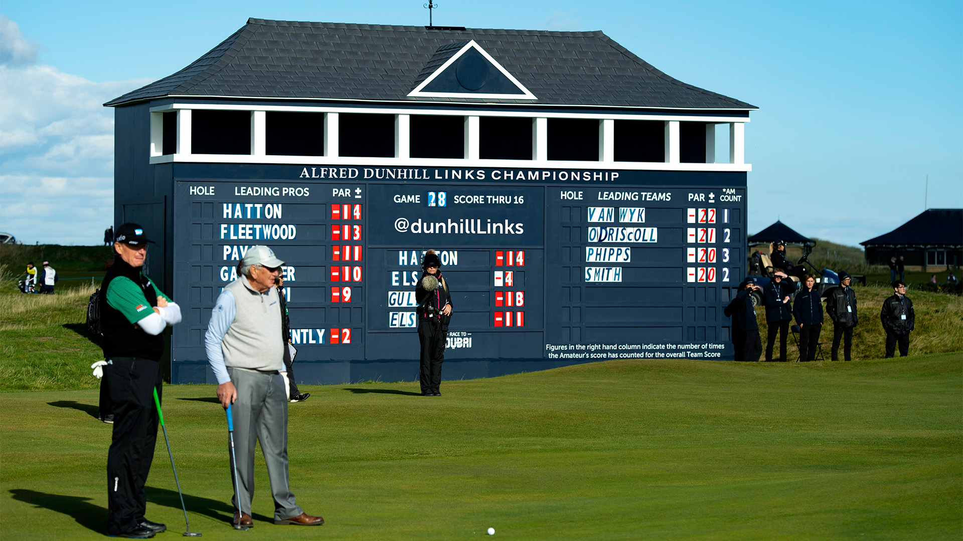
The Alfred Dunhill Links Championship is one of the world’s leading golf events. It is a magnet for golfers from every corner of the globe.
In 2013 the ADLC was rebranded with revisions and updates to the typography, course layout and colour palettes.
The main objective of the rebrand was to make championship more in keeping with it’s environment and reflect the hues and tones of its Scottish surroundings.
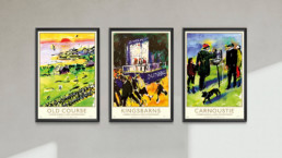
Harold Riley Advertisement Posters
These sets of 3 advertisement posters are positioned around St. Andrews pre-tournament. They can be seen within the local shops, notice boards and on digital billboards within Edinburgh airport prior to the event. The posters are to bring attention to the Links tournament and St Andrews.
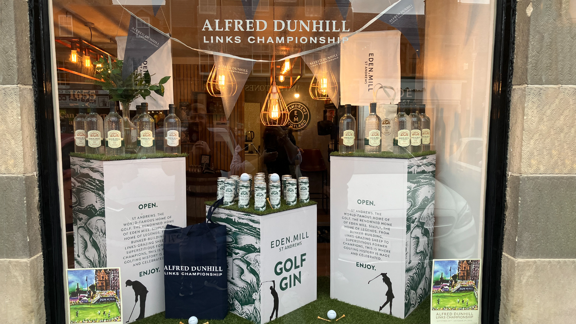
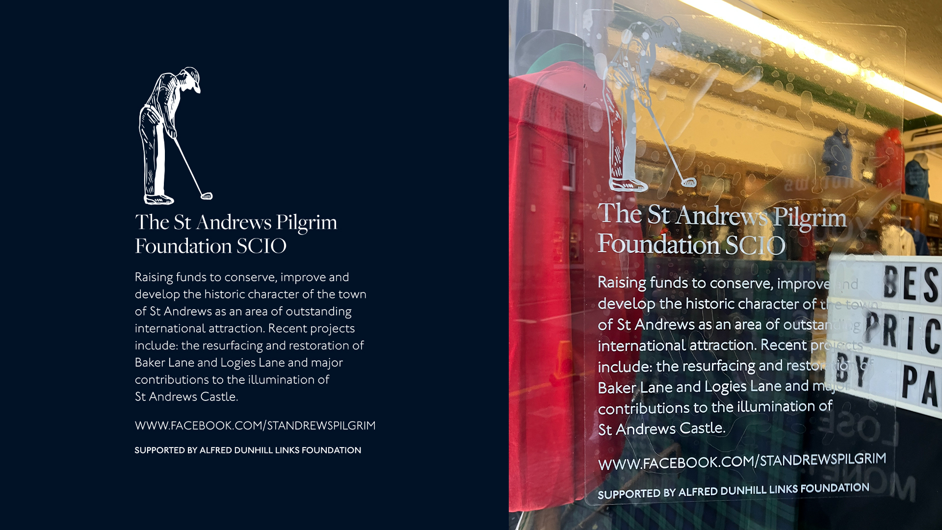
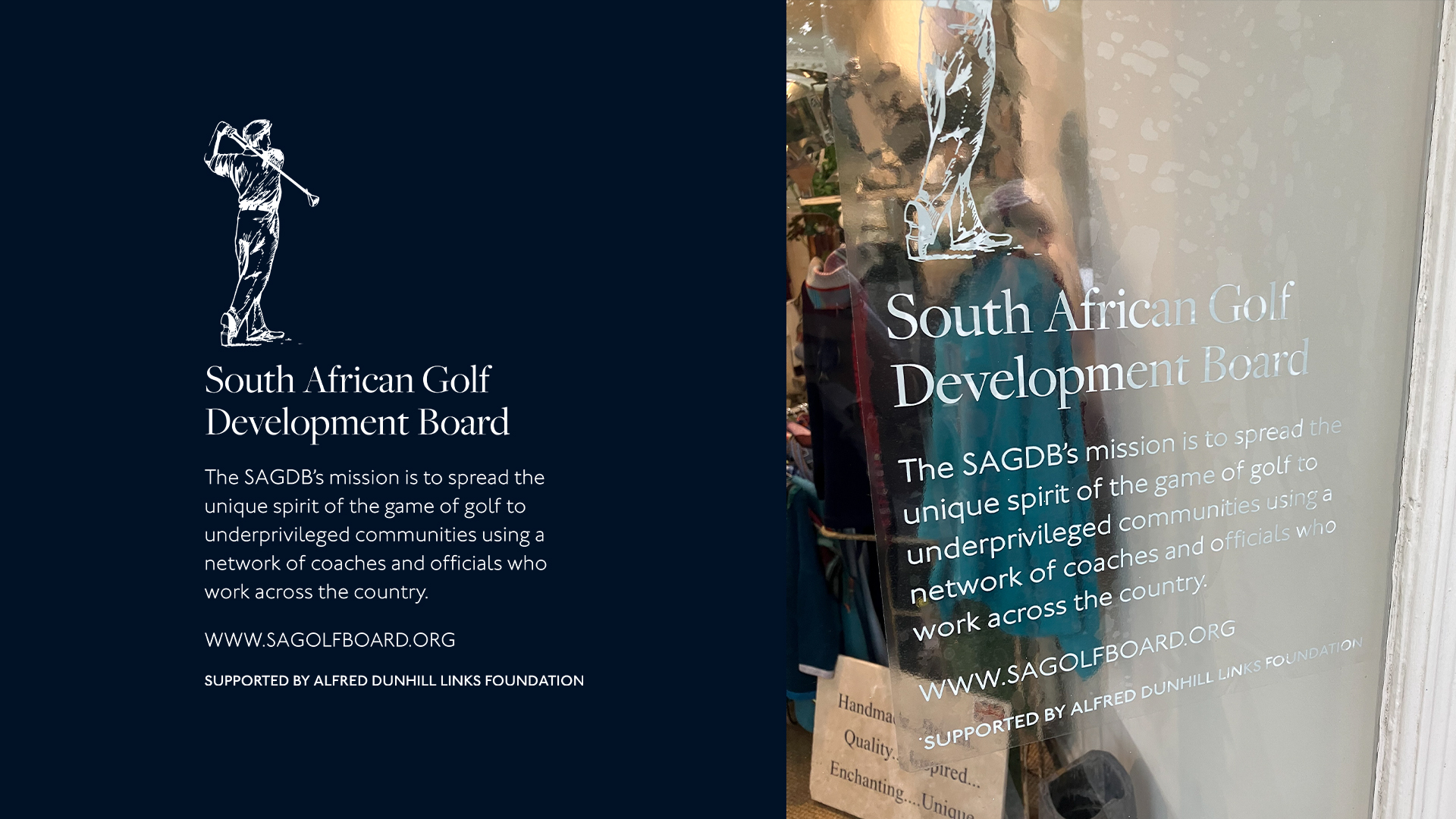
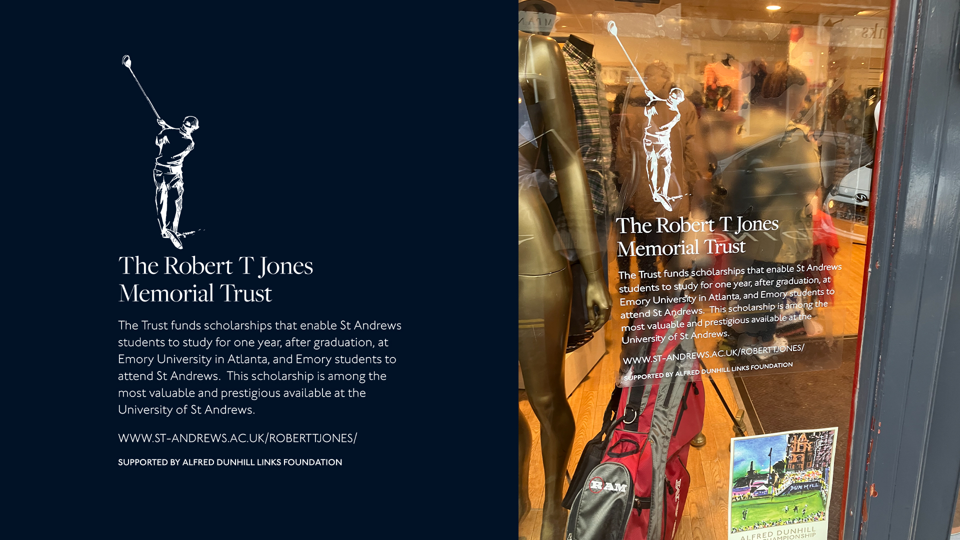
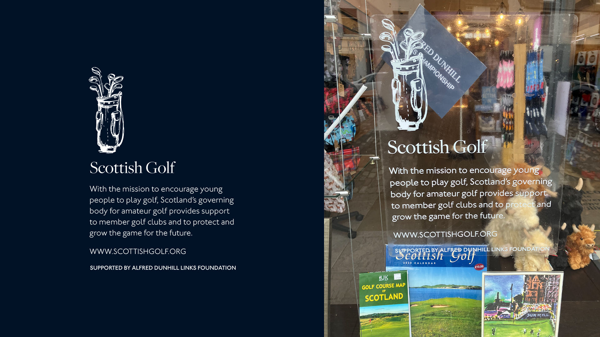
Window Display
These stickers are used on window display in shops around St Andrews that’s used to inform about all five beneficiaries of Alfred Dunhill Links.
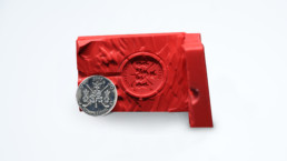
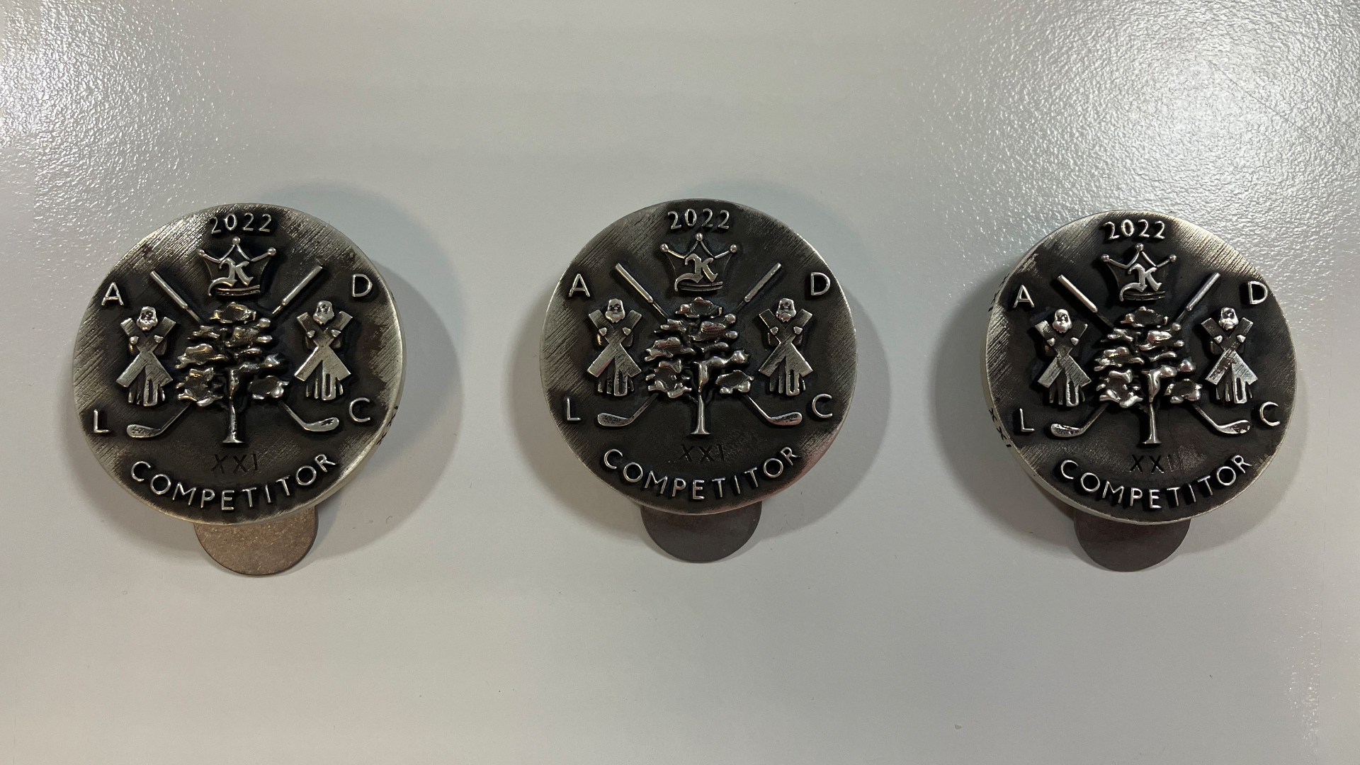
Alfred Dunhill medal
Each medal is hand cast and hand engraved, the engraver having over 40 years of experience in working as a master engraver for the royal mint. This ensures that each medal is unique and they are produced in a numbered edition and each number is assigned to a particular player.
In the years to come, the dunhill medal/money clip will be seen as iconic and desirable as the dunhill lighter was in years gone by. You should look after and cherish a medal if you receive one as they are not for sale, not transferable, and irreplaceable.
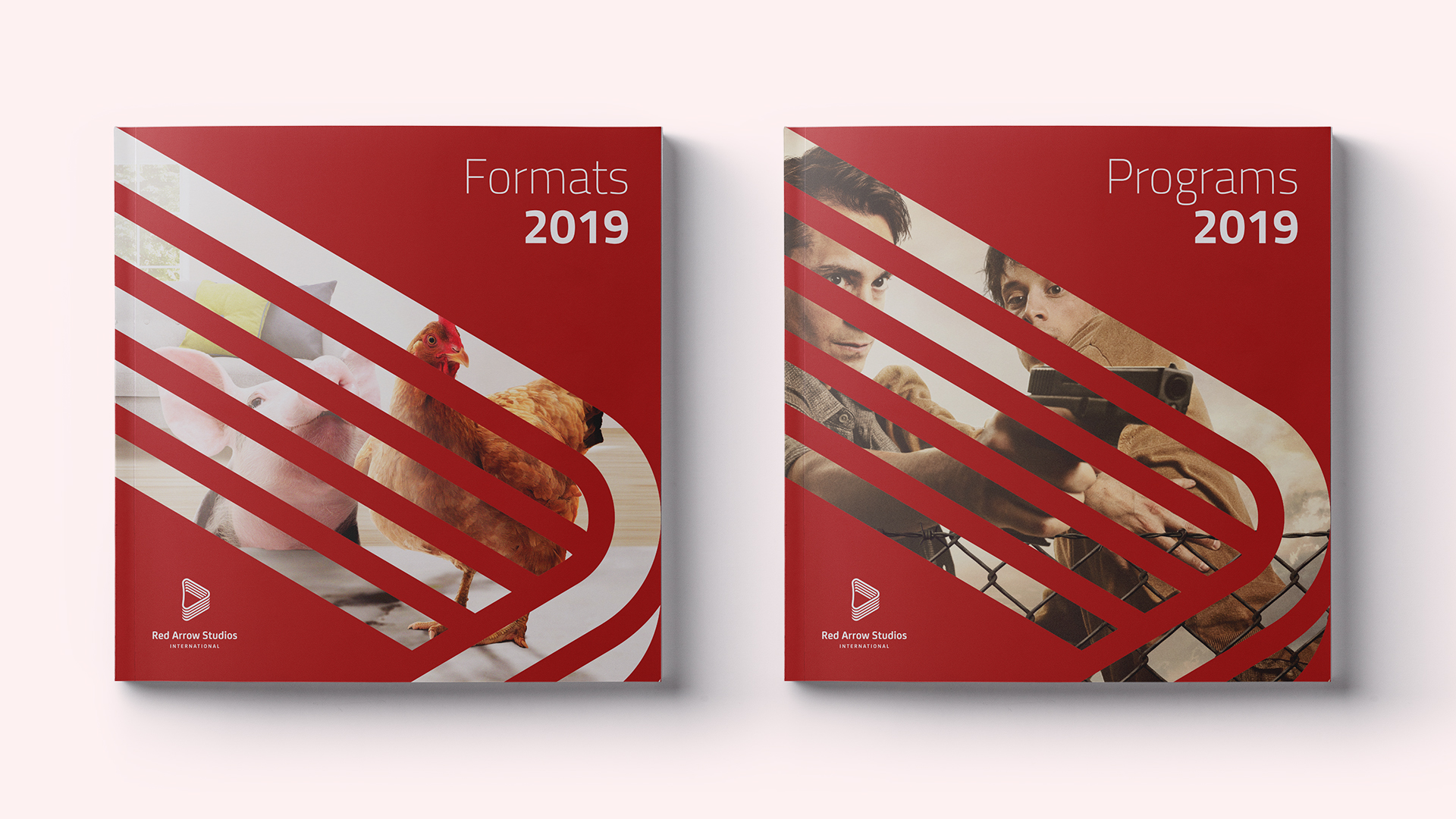
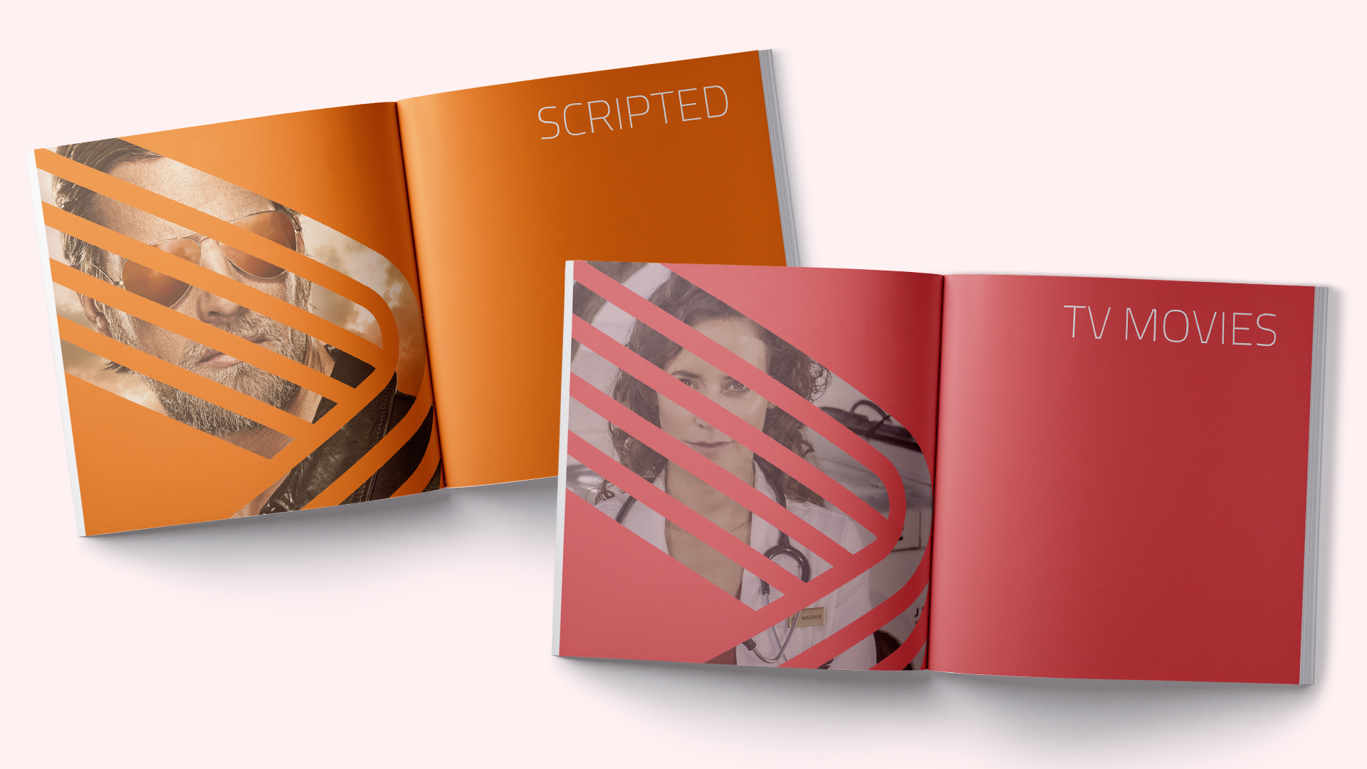
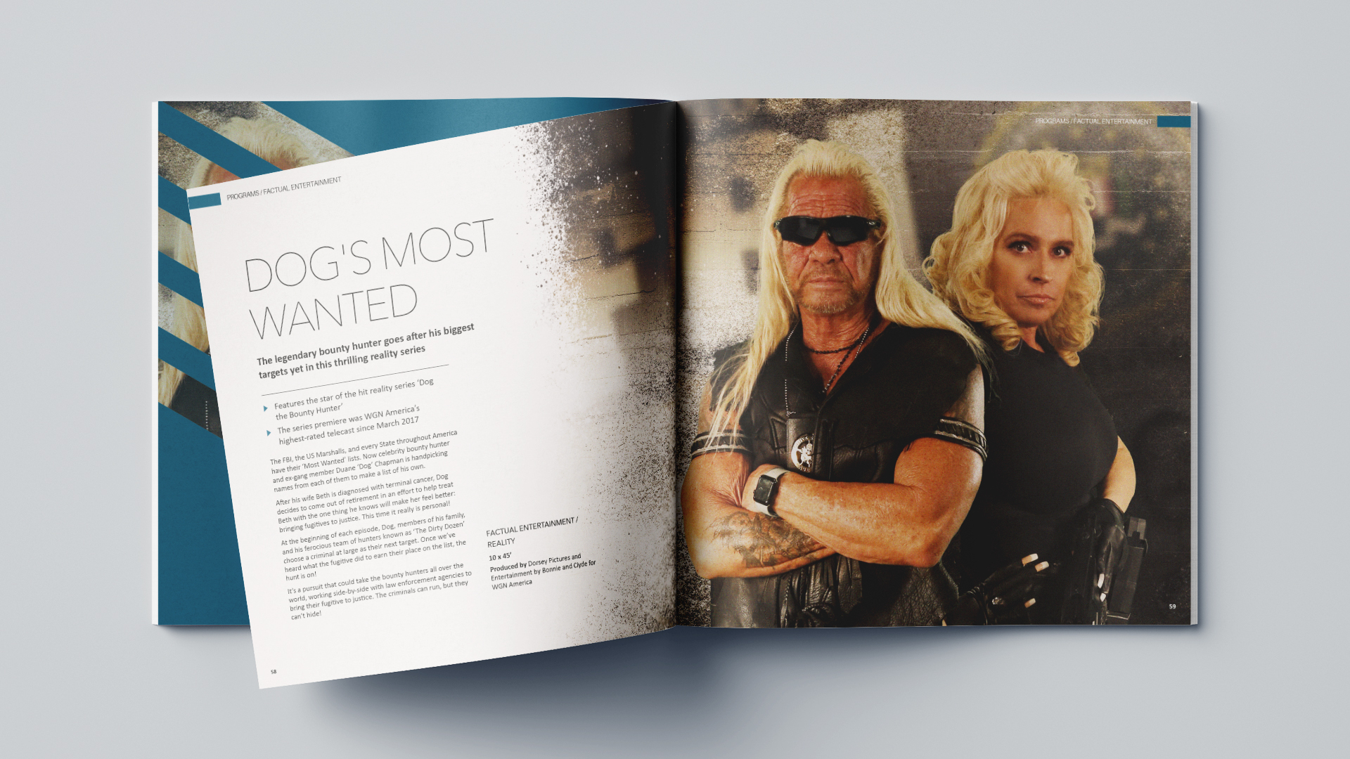
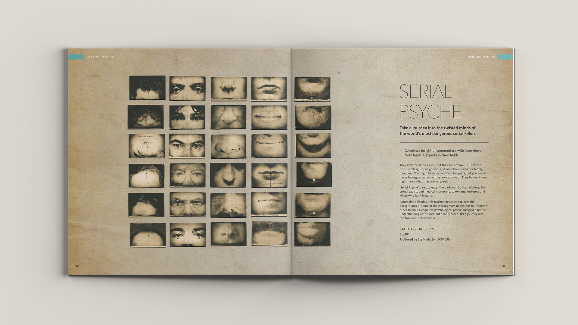
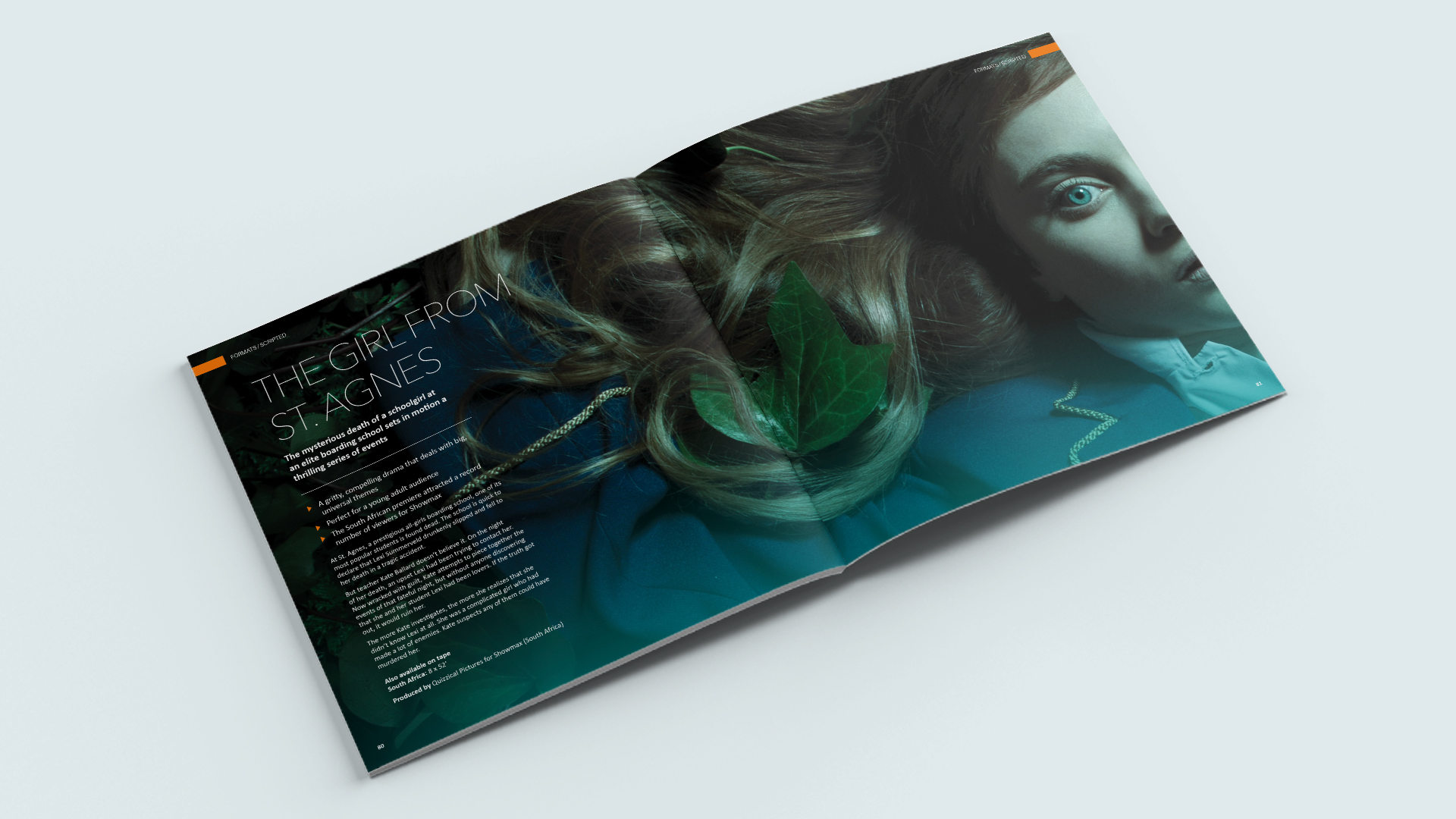
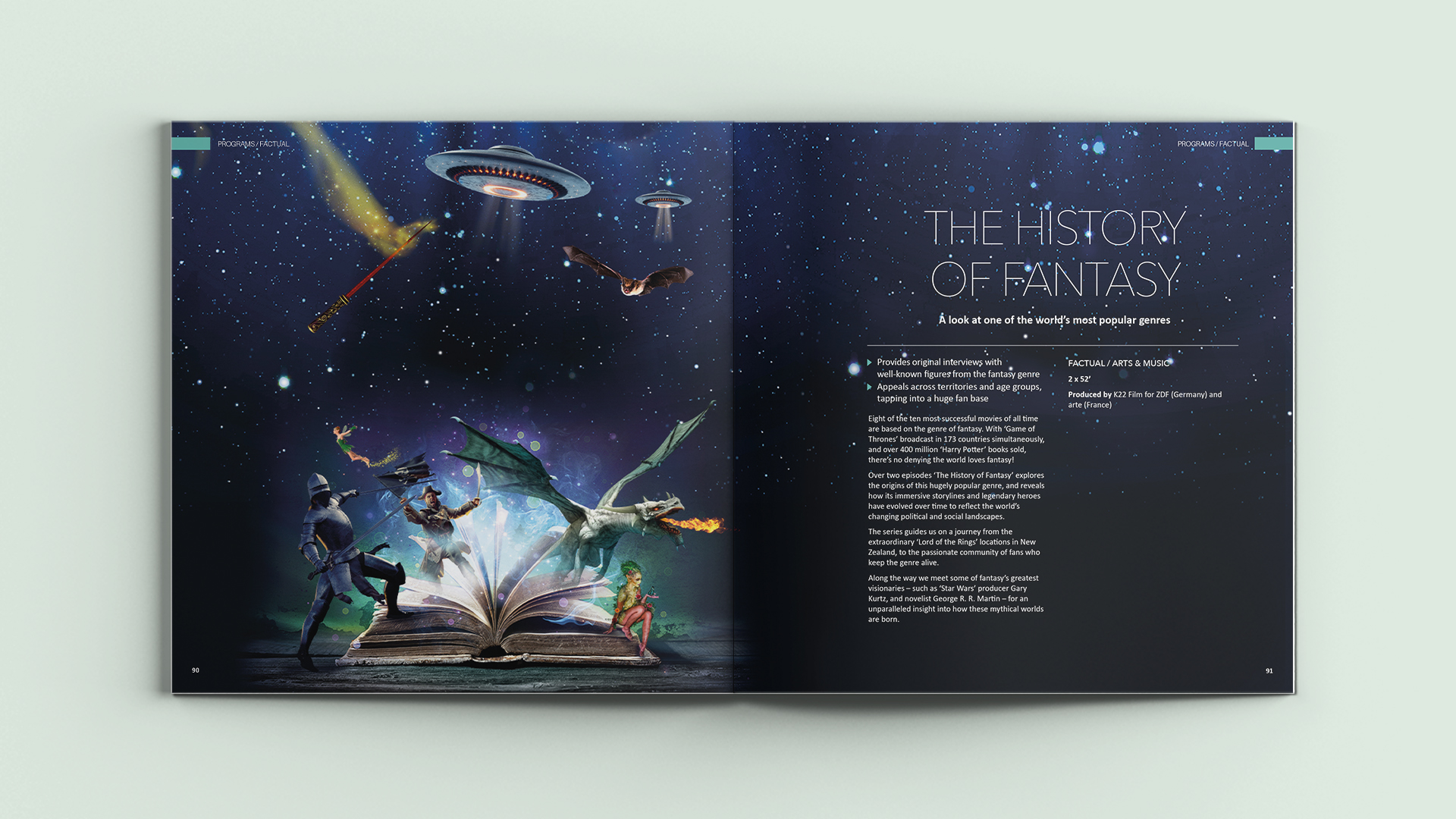
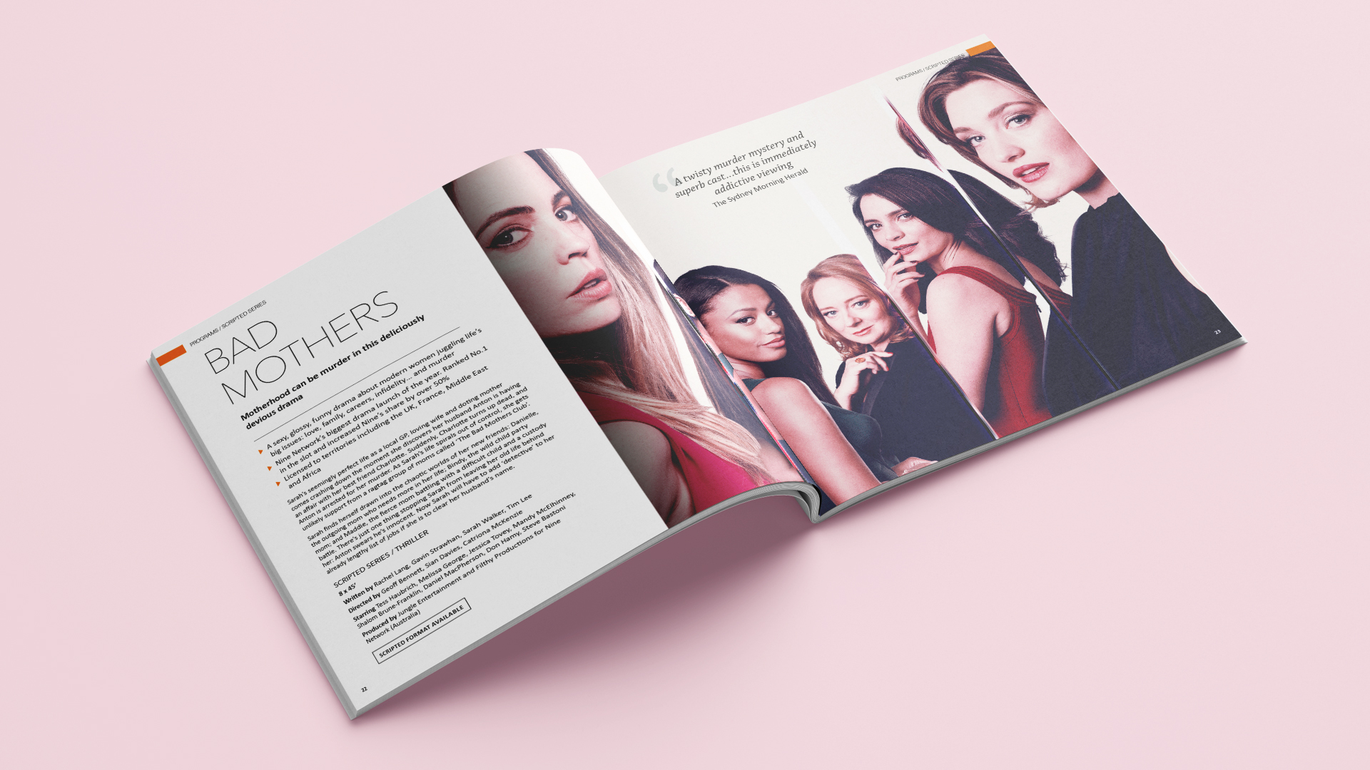
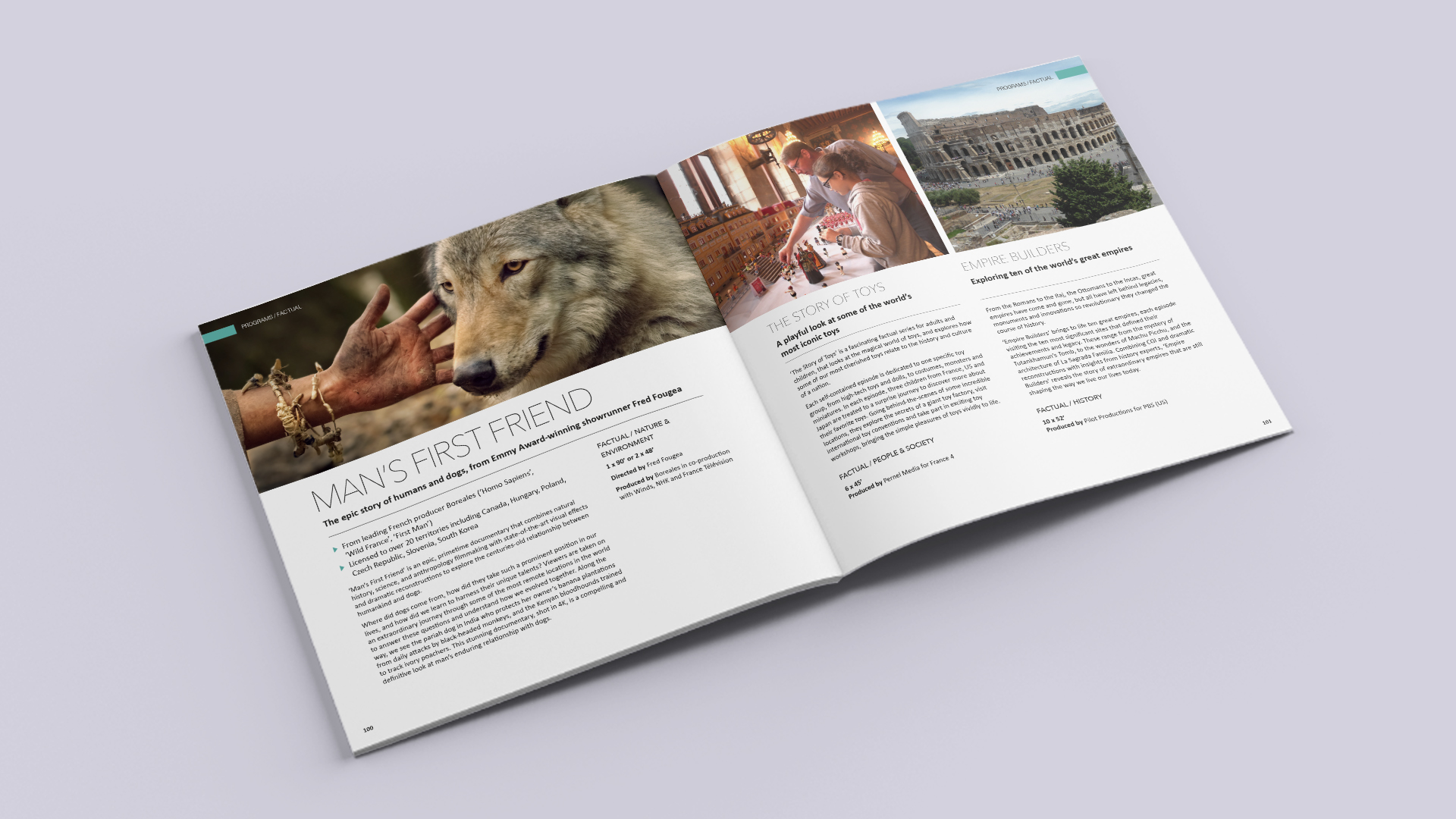
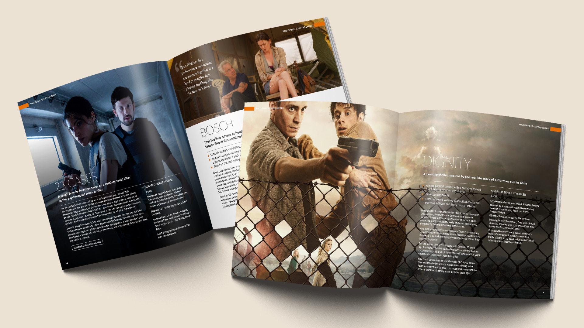
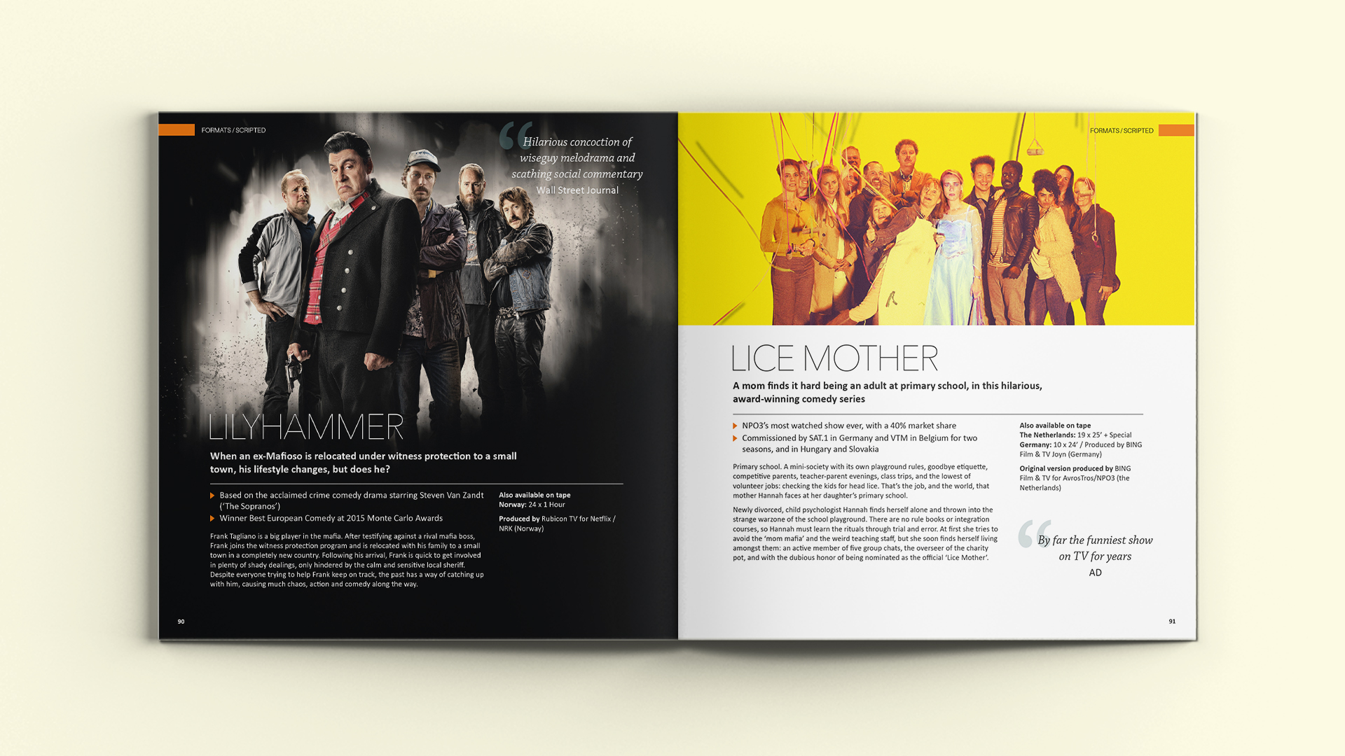
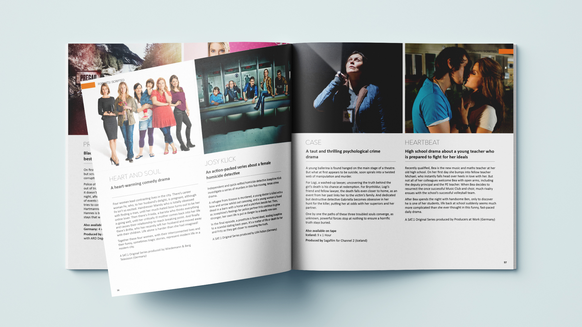
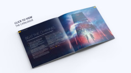
Red Arrow Catalogue
Red Arrow Catalogues MIPCOM
Client: Red Arrow
Type: Branding
Cannes, France, hosts the leading global TV and digital content market twice a year (MIPCOM & MIPTV). These catalogues for Red Arrow are the sales teams biggest tool when it comes to getting a deal from distributers and co-producers for new and existing programmes and formats.