Laureus Rebranding
Client: Laureus
Type: Branding
The task was to rebrand Laureus. We wanted to create something dynamic and fun, whilst reflecting the brand identity and its sub-brands.
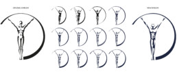
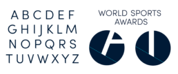
The Laureus logo was modified to be bolder and stronger. One of the important things to get right was recreating the emblem, so there were many development stages. We based our branding from the angles that existed in the emblem. To add character and brand the typography as Laureus, we used an angle from the emblem to slash off the bottom foot on certain letters.
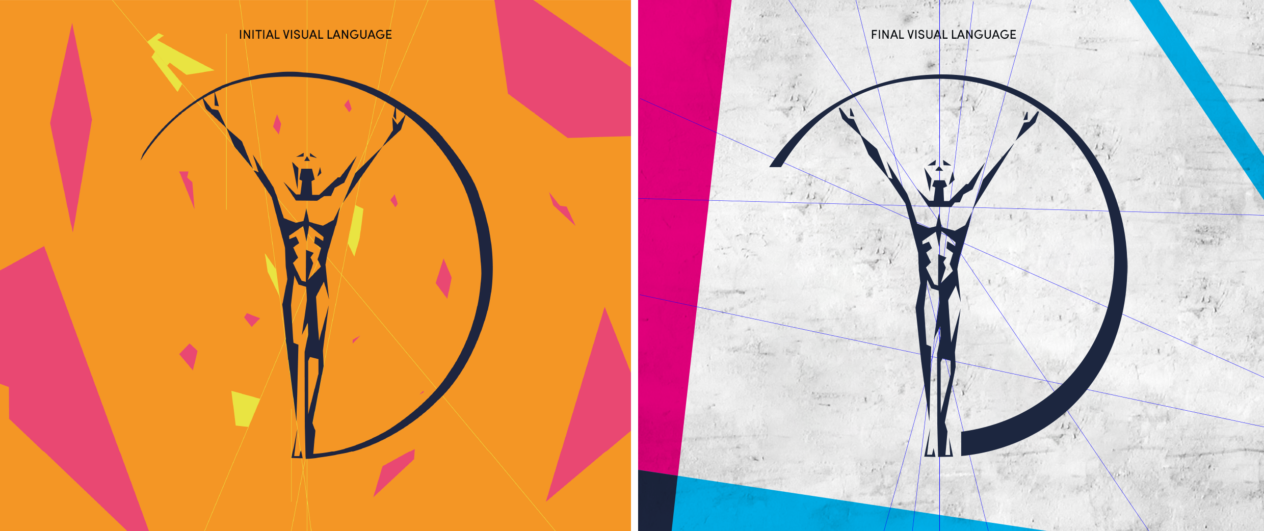
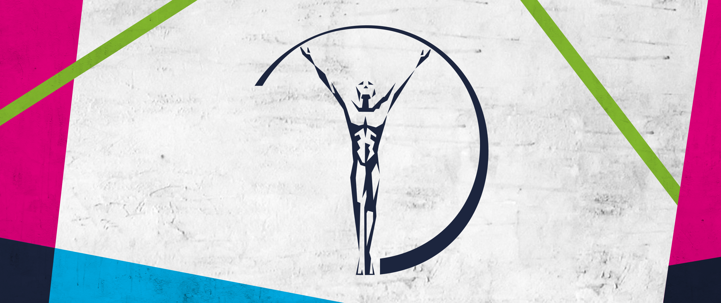
The overall branding includes angled shapes and stripes to add an urban feel and portray the colour palettes from each sub-genre tastefully.
We created a separate Sport for Good logo to be used for physical branding purposes such as, on clothes, on event banners or the hood of a car. This way it increases the spread of the brand identity.
Click here to see the final implementation of the Laureus rebrand.