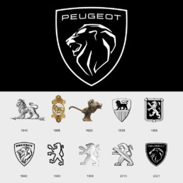
Peugeot removes lion’s body from logo after almost 50 years!
Peugeot has unveiled a redesigned logo, featuring a lion’s head as part of a rebrand to mark a new era of electric car manufacturing. It appears to be a redesign of the logo used throughout the 1960s A lion’s head roaring with a geometric graphic style favours the integration of logos to the new generation by removing the “boomers” chromatic style. Many reactions welcome this return of a fierce, bestial and conquering logo. What are your thoughts?

