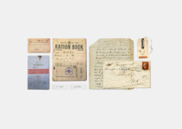
The year is 1942 and you need to shoot a scene where your actor shows their Rations Book at the butchers, but where to get one? Don’t worry, we can create one for you… and make it look like you’ve used it every day for the last 2 years. We can even make the coupons!
While film directors are recognising the importance of the role graphic designers have to play in films, it is still something that maybe a lot of people do not think about while watching a film? Yes, we have seen the faux pas of a plane flying over the head of Maximus Decimus Maridius inside the Colosseum and Gandalf wearing a very nice digital watch (wizards need to know the time too, you know) so our point of view is, NOT noticing graphic content in the background of a film is something that is always trying to be achieved.


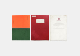
The King’s Speech released in 2011 and directed by Tom Hooper is an example where there is lots graphical content; in which 95% of it may go un-noticed but are all pivotal to creating the realism of feeling a film set during WWII created in 2011.
The green elocution and pronunciation book handed to Colin Firth to read while he visits Geoffrey Rush needs to feel of its time. It needs the worn edges and the water stained cover to keep the story ‘real’ and feeling authentic. Research needs to go into what typefaces were popular during that period, how the language is used and what products were able to be advertised of that time. We as graphic designers relish this challenge and take no better pride than seeing that letter from Buckingham Palace appearing in scene after without the audience really noticing it.
But it doesn’t just have to be small printed ephemera. It can be BOVRIl posters on the sides of buildings, bus advertisements, shop fascias, packaging and more. You all remember the look of a WONKA bar, or the Jurassic Park identity. Think of the Harry Potter wanted poster or the poster as you enter Amity in the film Jaws.

