The AA’s Turbocharged Transformation!
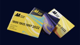
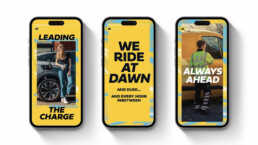
The AA unveils its fresh new look! Teaming up with Elmwood, the AA aims to shine a light on its diverse range of services beyond roadside recovery and breakdown assistance. The new identity employs patterns, iconography, and photography uniquely tailored for each AA services.
Their new tagline “Always Ahead” reflects their vision as an active leader in a changing market. The sleek new logo features smooth edges and exaggerated angles forming a new font, AA Sans. The palette’s foundation stays true, now with a deeper black that enhances the vibrant yellow. A clever secondary colour palette adapts to different times of day, symbolising the AA’s round-the-clock care.
Stay tuned for the “It’s OK, I’m with the AA” campaign, showcasing their 24/7 care!

