We gave Yakult a fresh take
For years, we’ve been advocates of better branding, great typography, brand positioning and all the rest.
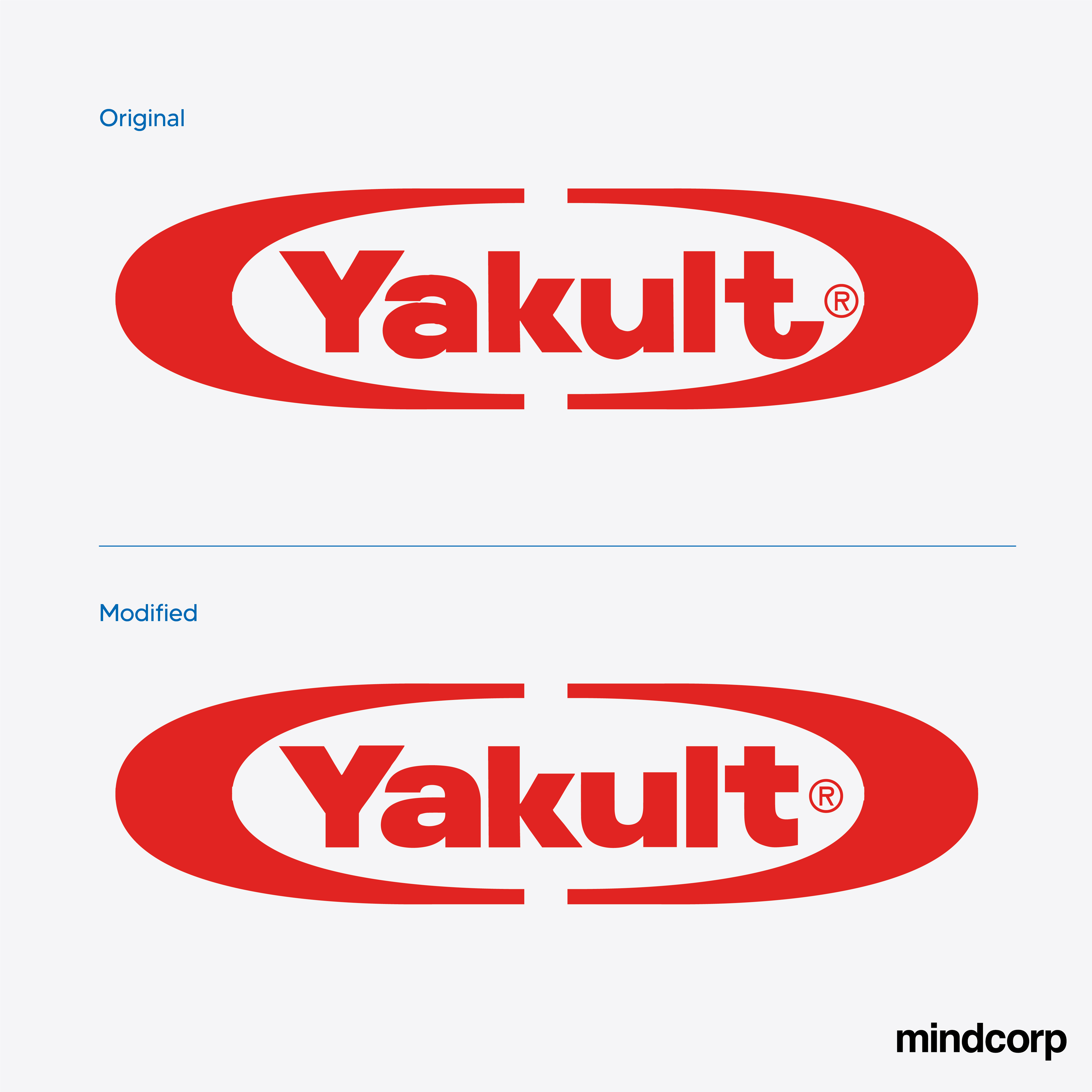
However, the Yakult logo has been driving me nuts for years. The ‘a’ the ‘u’ and the ‘t’ seems so naively realised.
So…we had a look at it.
Does it make it fresher? Does anyone care? Have we killed the innocence and playfulness of the marque?
Or do you have a logo in mind that you think also needs a revisit?
You tell us.