Eurosport's manga-inspired brand identity
Eurosport’s manga-inspired brand identity
Seeking a design that would be versatile, intertwined with the need to build a common story around all sports featured at Tokyo 2020, Eurosport’s creative inspiration centres on Manga – a unique style of Japanese comic book aimed at both adults and children.
The logo unites the Eurosport logo, Olympic rings and Manga-influenced Tokyo 2020 typeface, thus bridging the gap between western and eastern cultures and ushering Manga into a new era.

The making of the Tokyo 2020 Olympic medals
The making of the Tokyo 2020 Olympic medals
The design of the Tokyo 2020 Olympic medals reflects the concept that, to achieve glory, athletes have to strive for victory on a daily basis. The medals resemble rough stones that have been polished and now shine, with “light” and “brilliance” their overall themes.
The medals collect and reflect myriad patterns of light, symbolising the energy of the athletes and those who support them. International Olympic Committee regulations stipulate that the obverse medal design should include the following elements: -Nike, the Greek goddess of victory, in front of the Panathinaikos Stadium -The official name of the respective Games, in this case Games of the XXXII Olympiad Tokyo 2020 -The Olympic five rings symbol

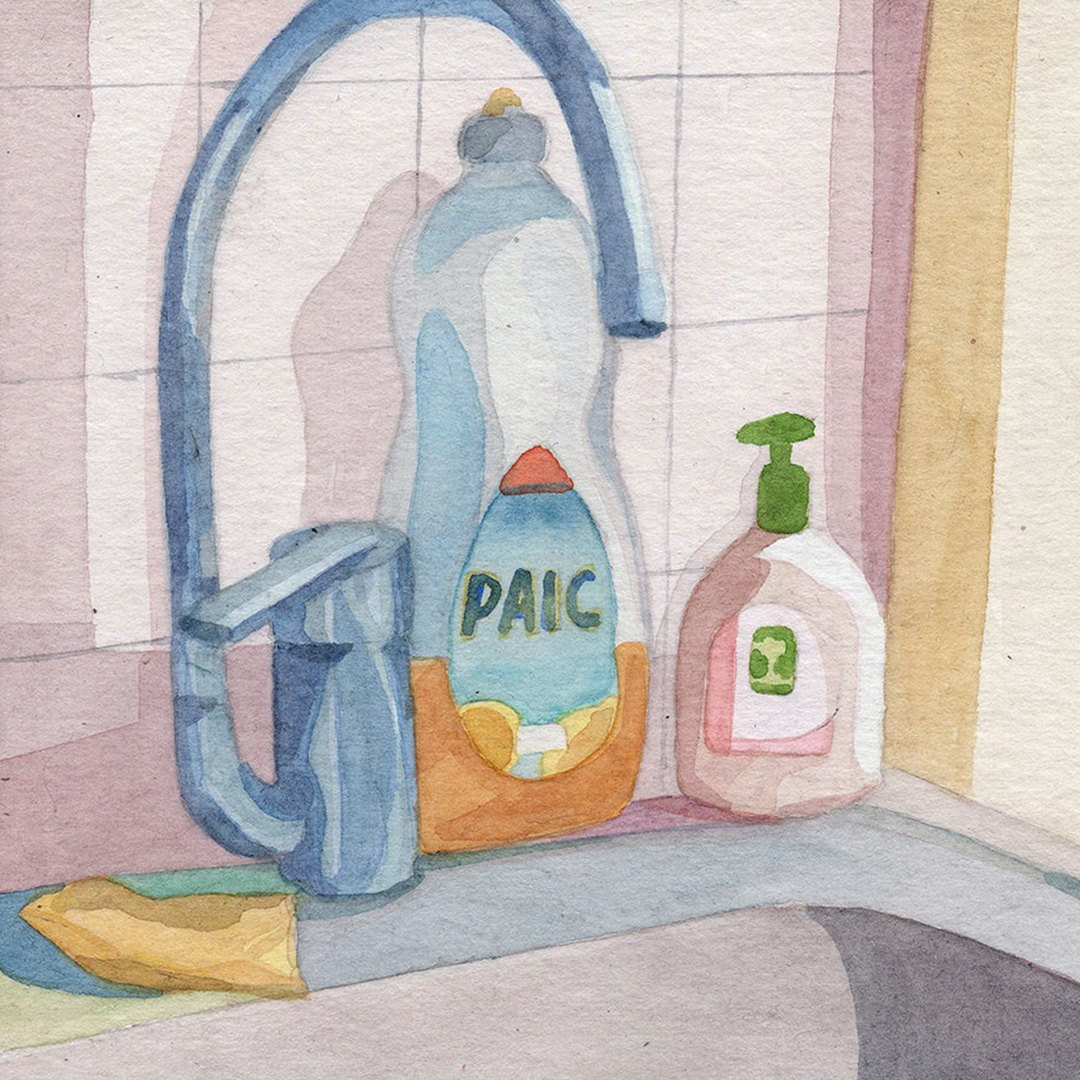
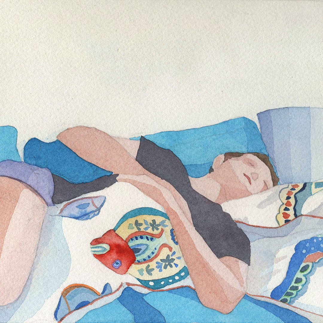
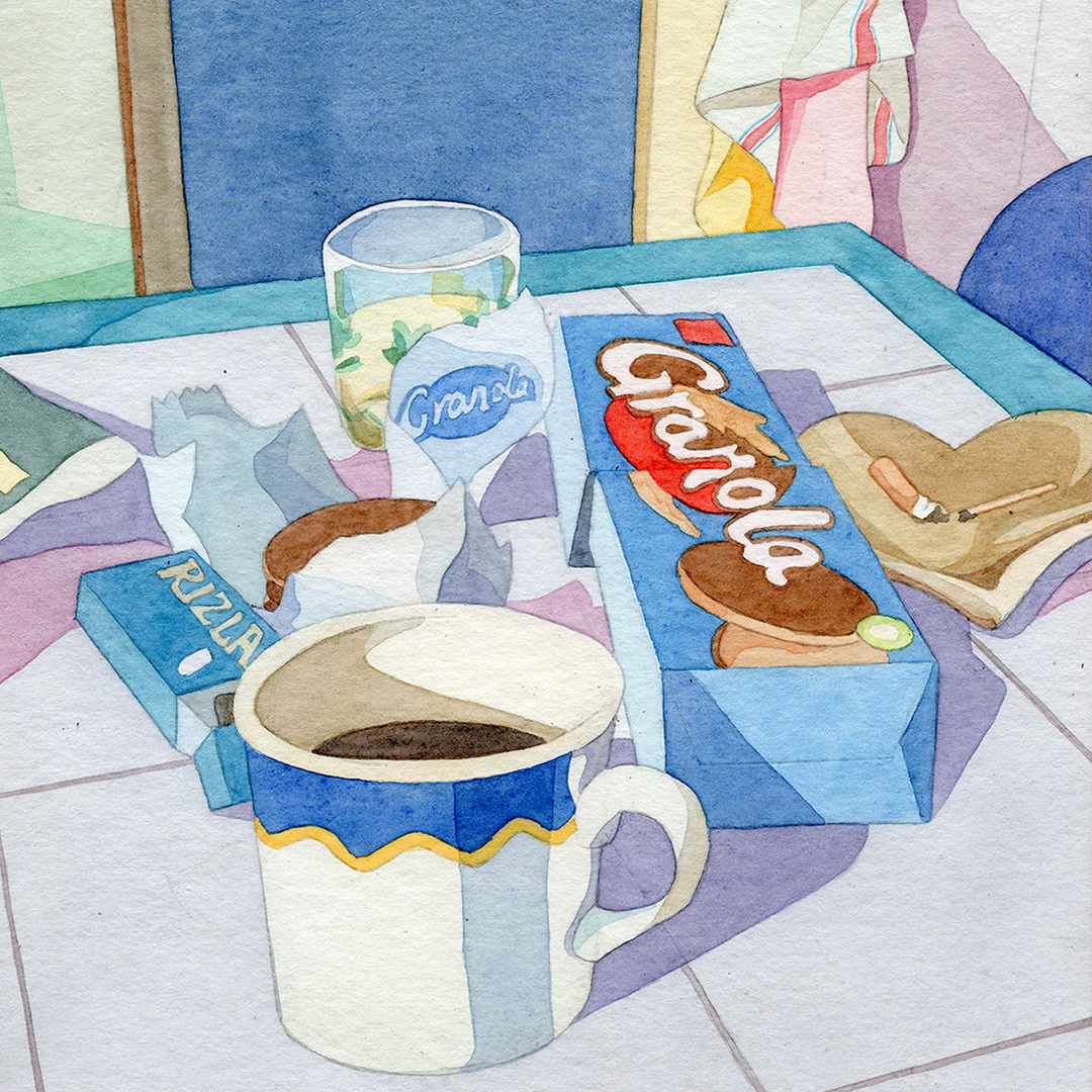
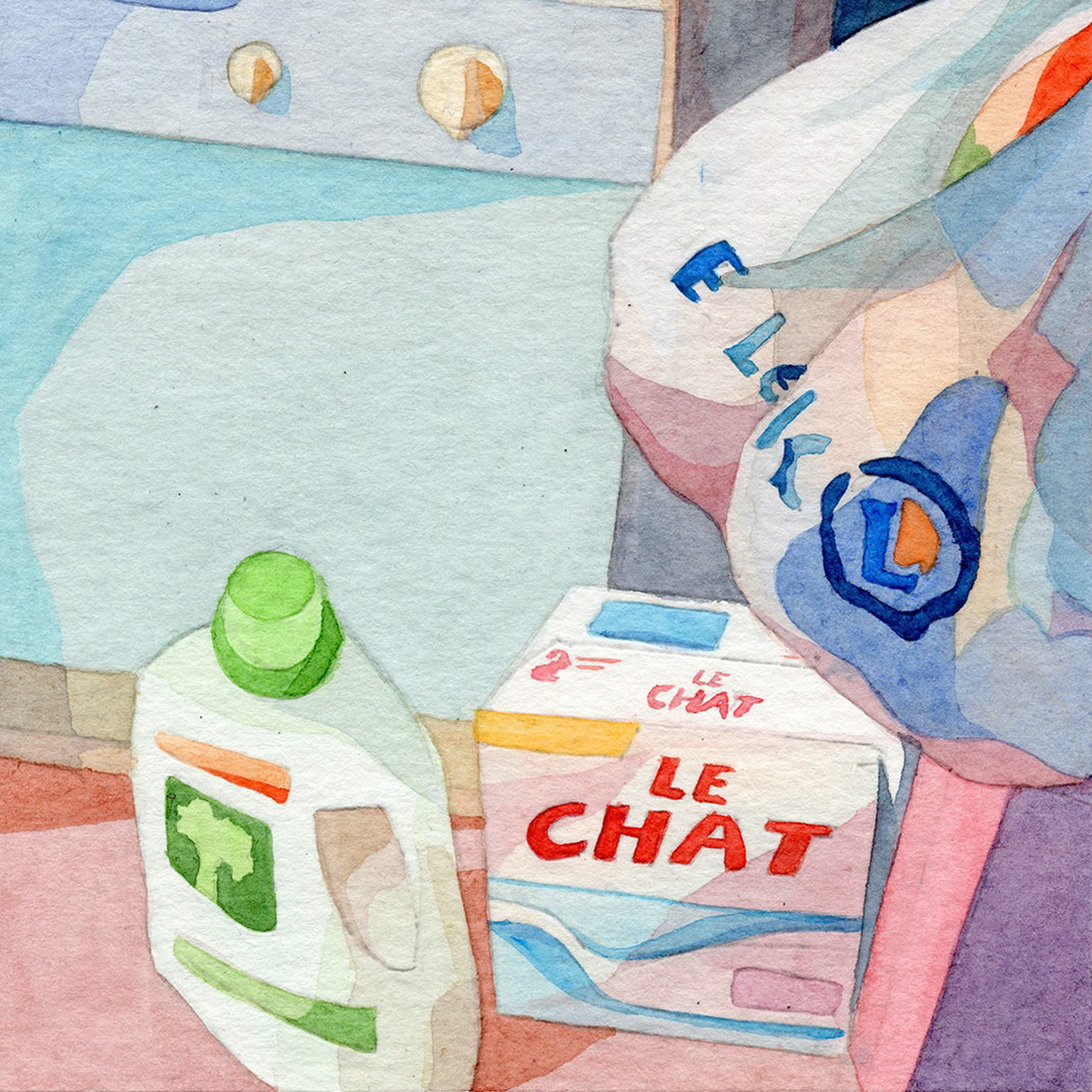
Illustrator Jean Aubertin uses watercolours to capture the everyday
Illustrator Jean Aubertin uses watercolours to capture the everyday
While drawing has always been an everyday practice for Jean Aubertin, his career as an illustrator is a fairly recent path he’s taken.


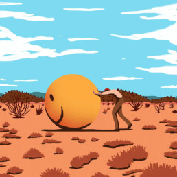
Gastón Mendieta concepts into cinematic illustrations
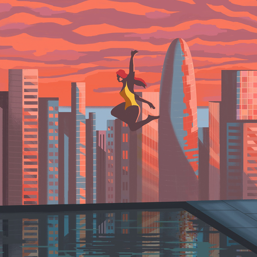
Gastón Mendieta distills complex concepts into cinematic illustrations
Creating work for the likes of GQ, New Scientist and The New York Times, Mendieta talks about why continuing to experiment is key to his practice.
With an interest in drawing from an early age, after art school Mendieta experimented for a while before he landed on illustration as a career. Since then, he’s been building a portfolio of monochromatic works that feel almost cinematic in their composition.